Client
The Beautiful and the Damned
Category
Brand Identity, Label Design
Location
Chicago, Illinois
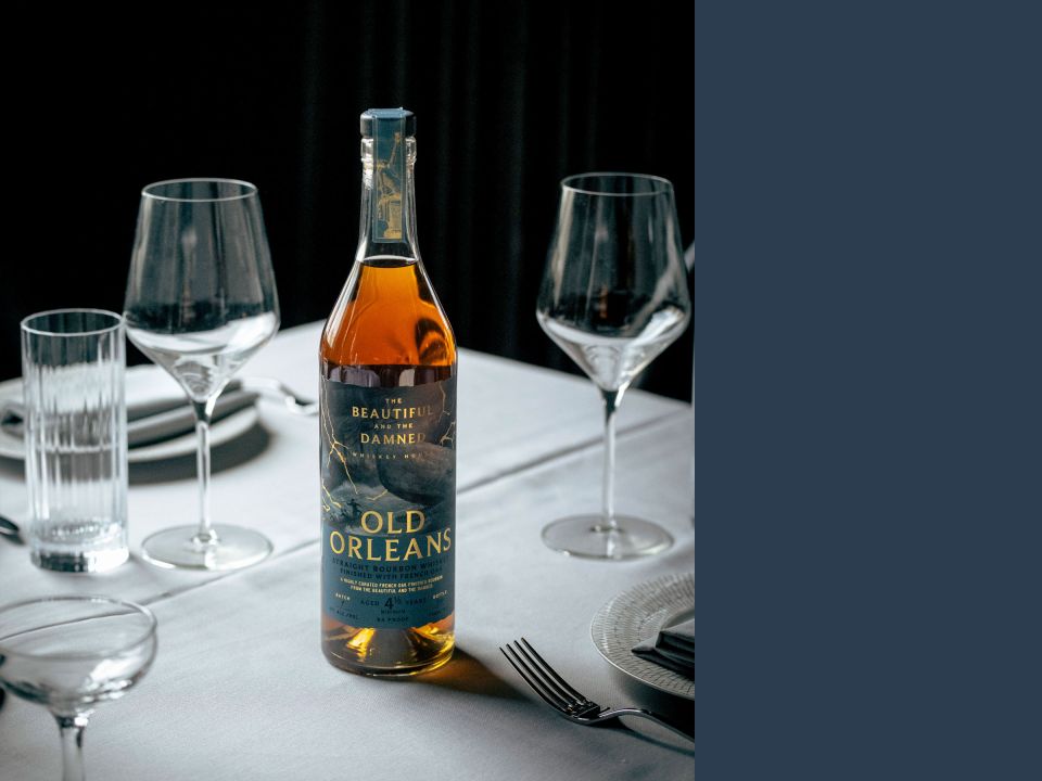
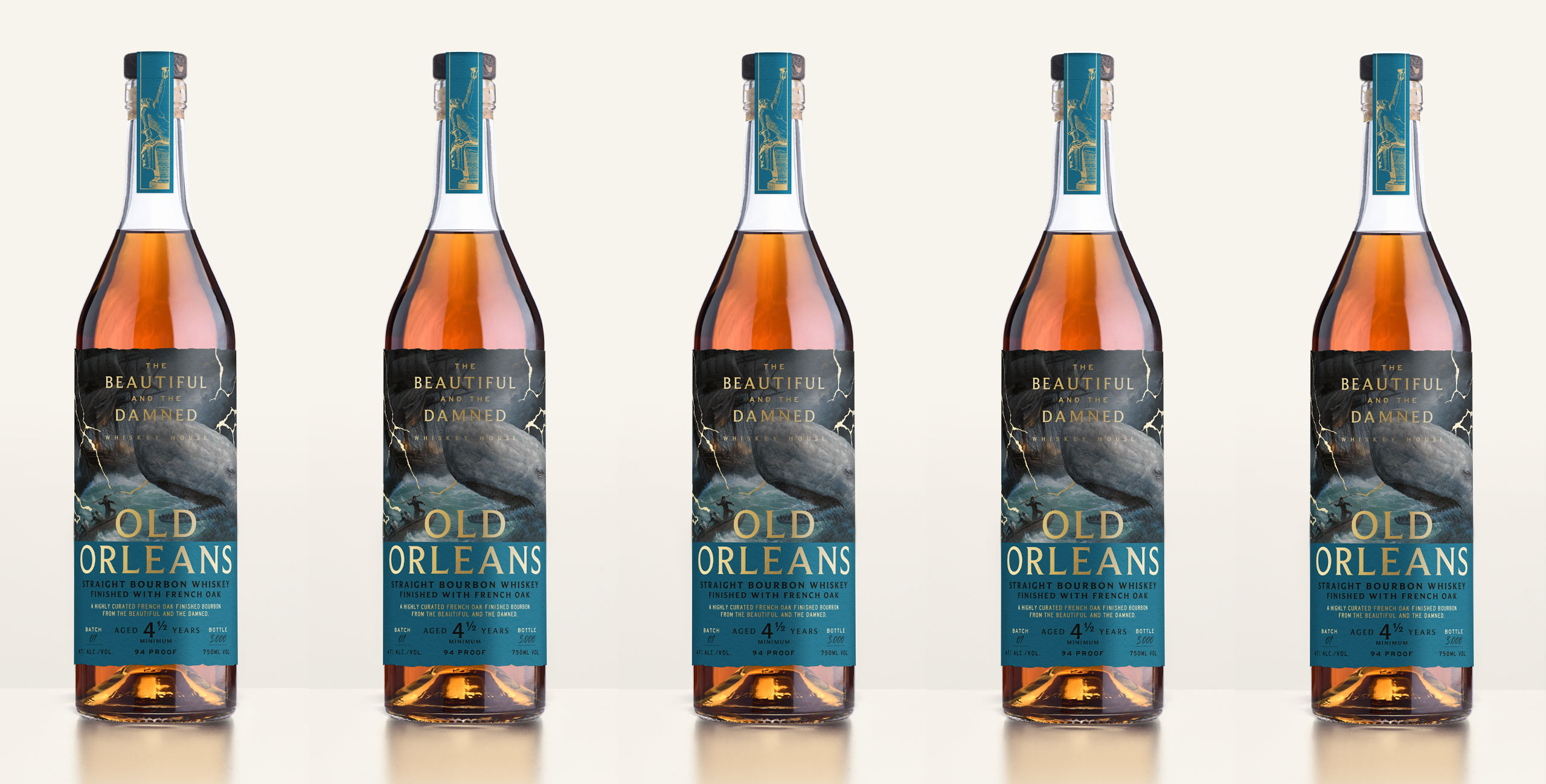
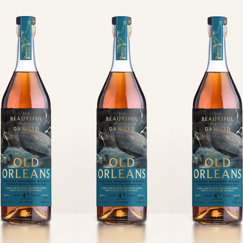
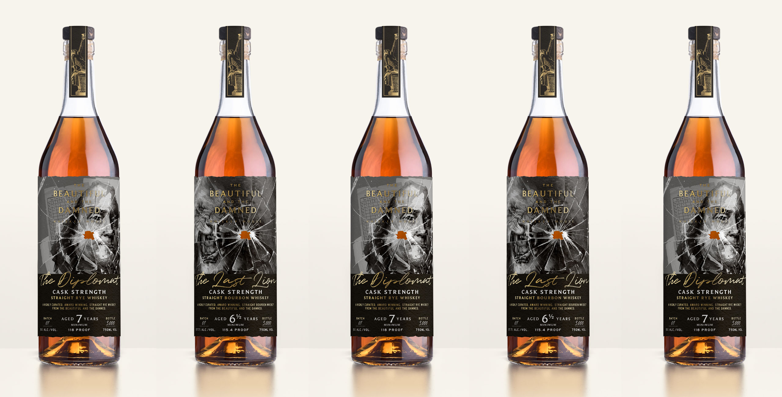
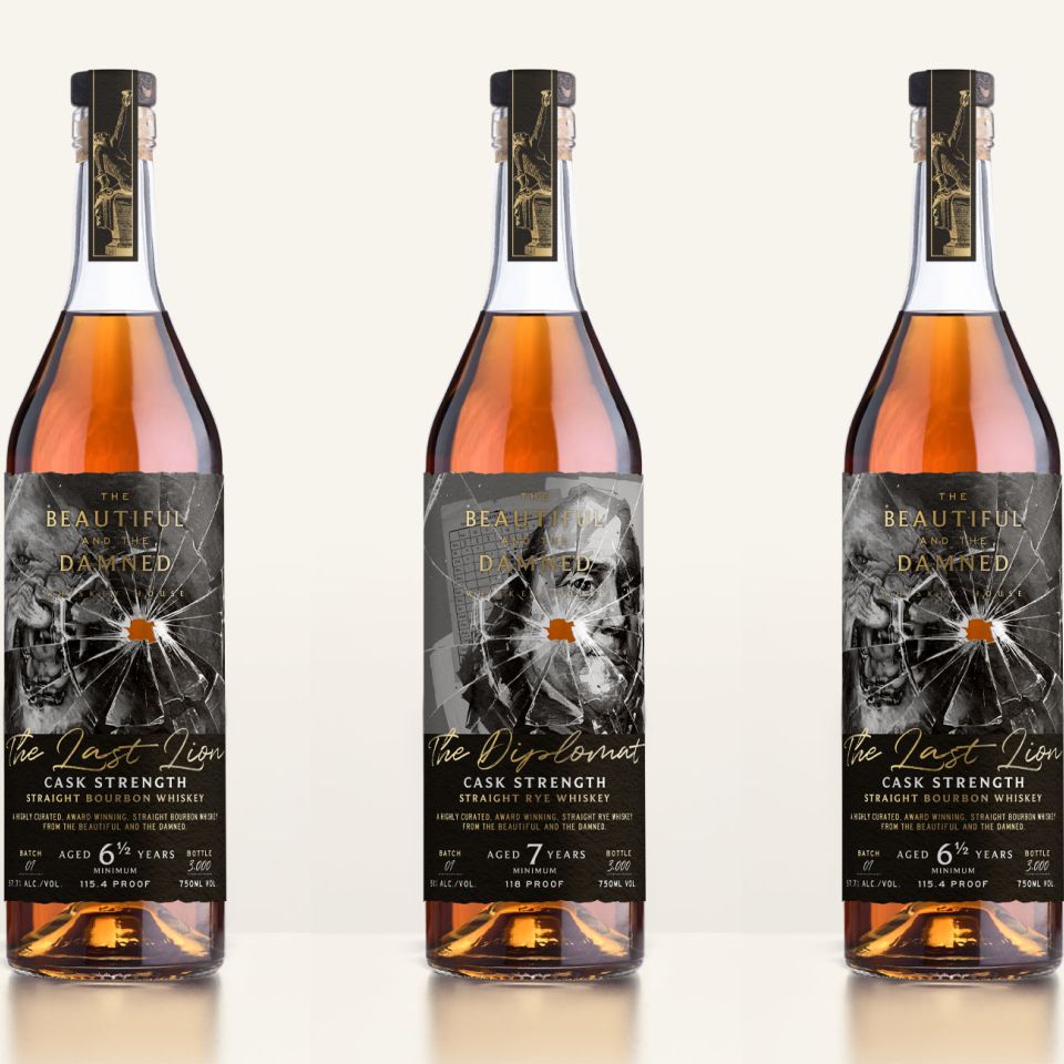
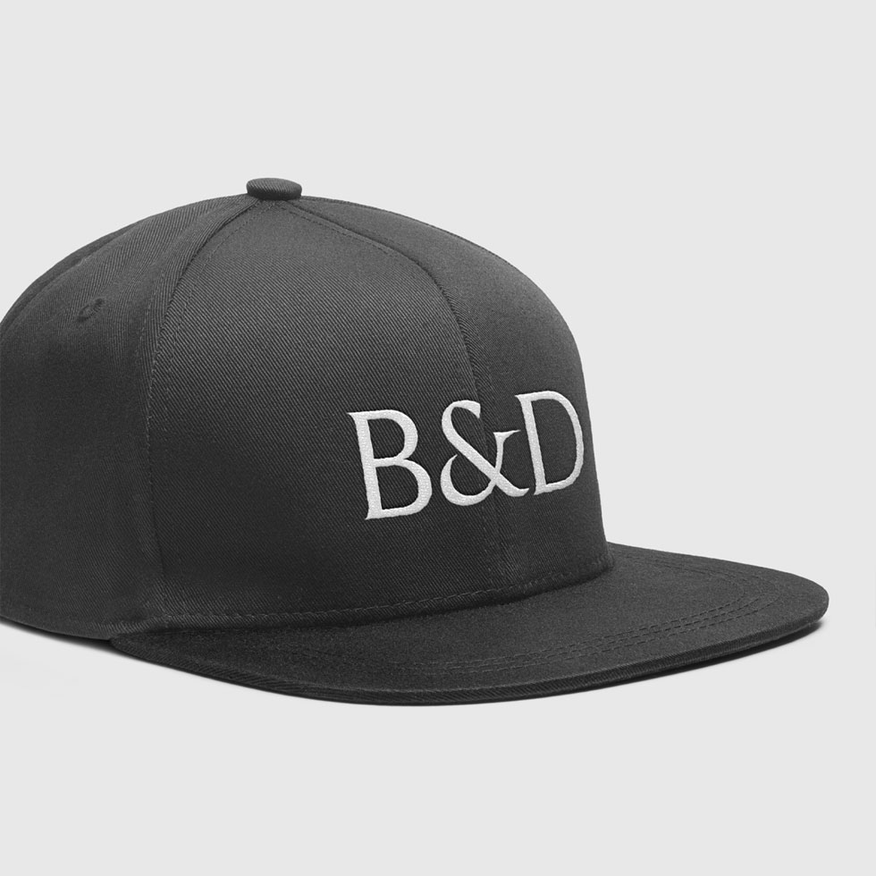
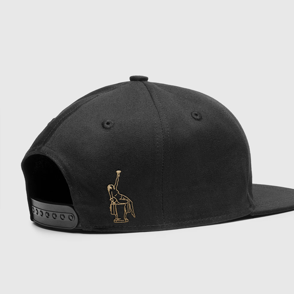
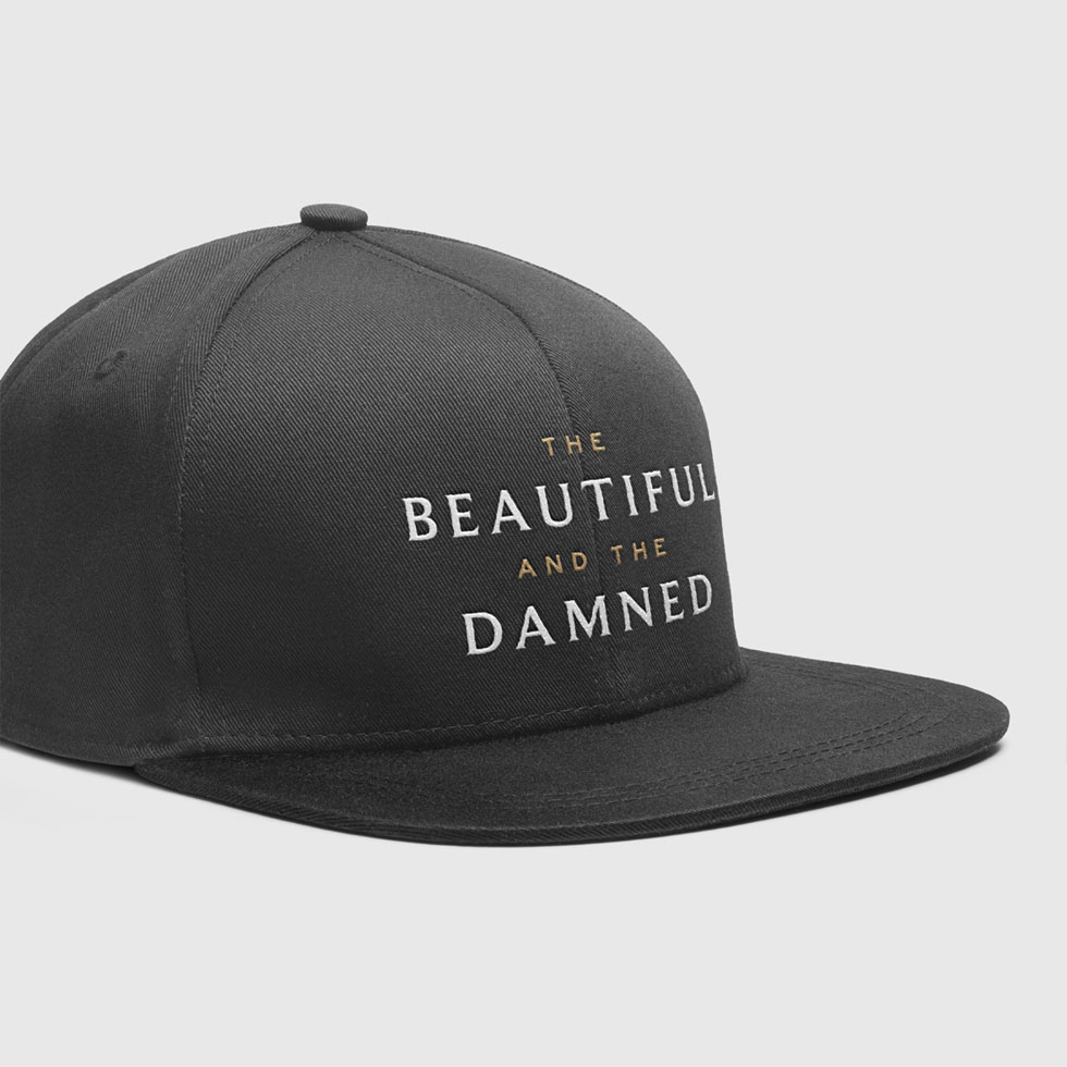
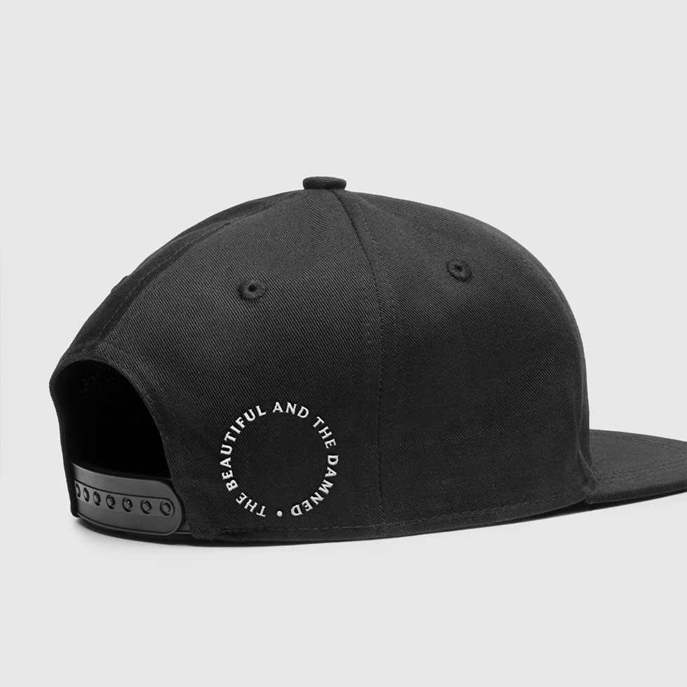
The Beautiful and the Damned Whiskey House create some of the best bourbon and rye whiskeys in the USA. We worked closely with the company founder to create a new brand identity and updated label designs for their new and future product releases.
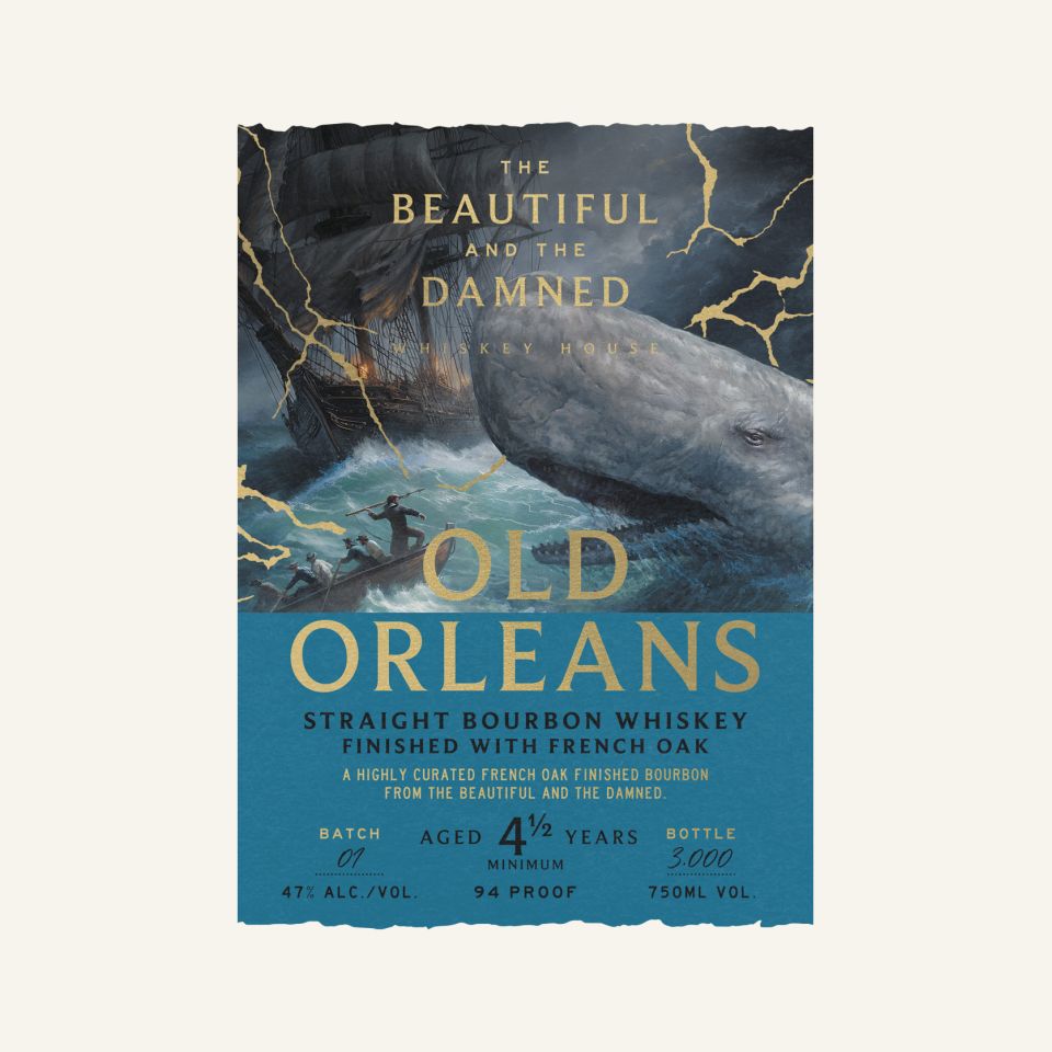
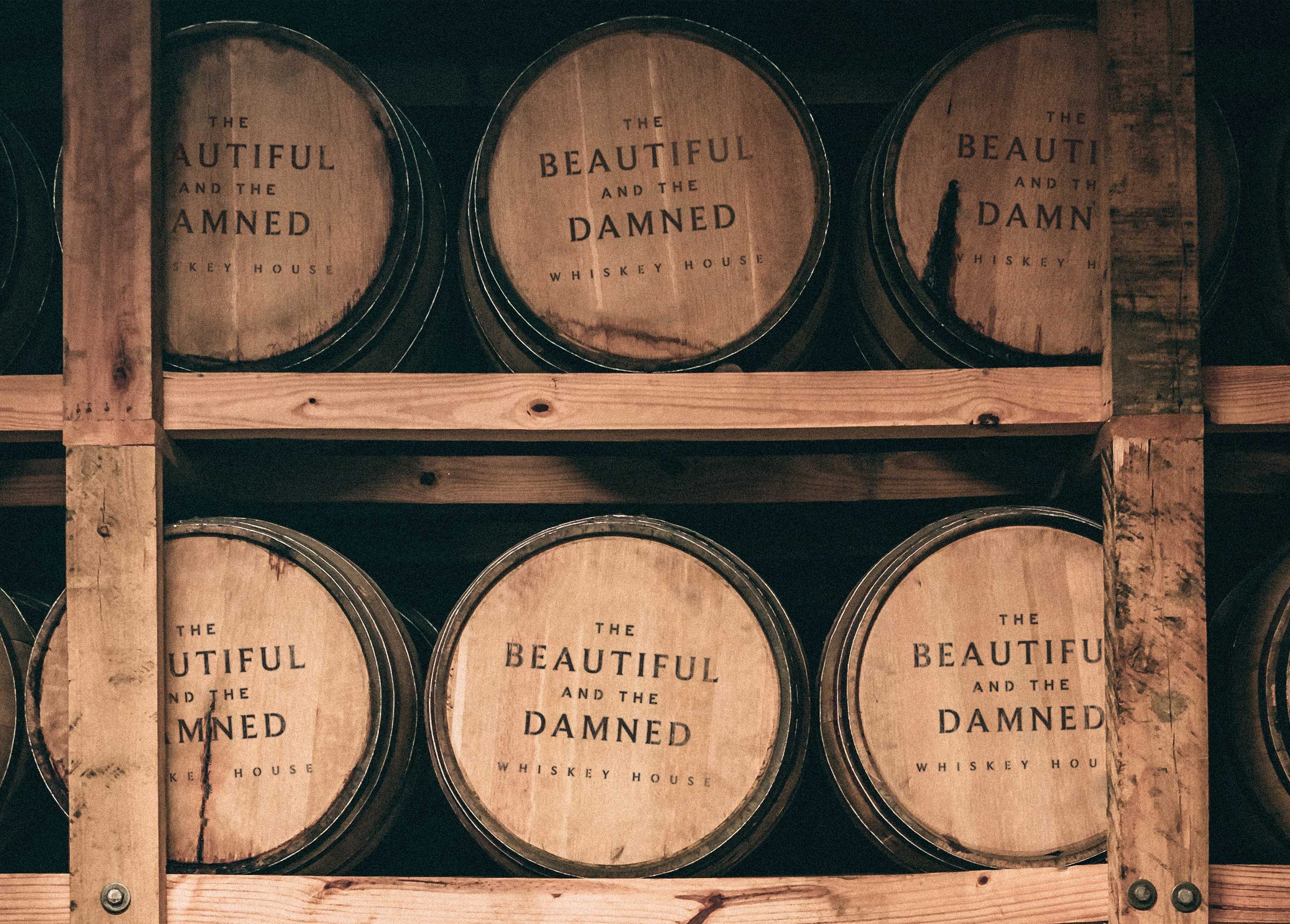
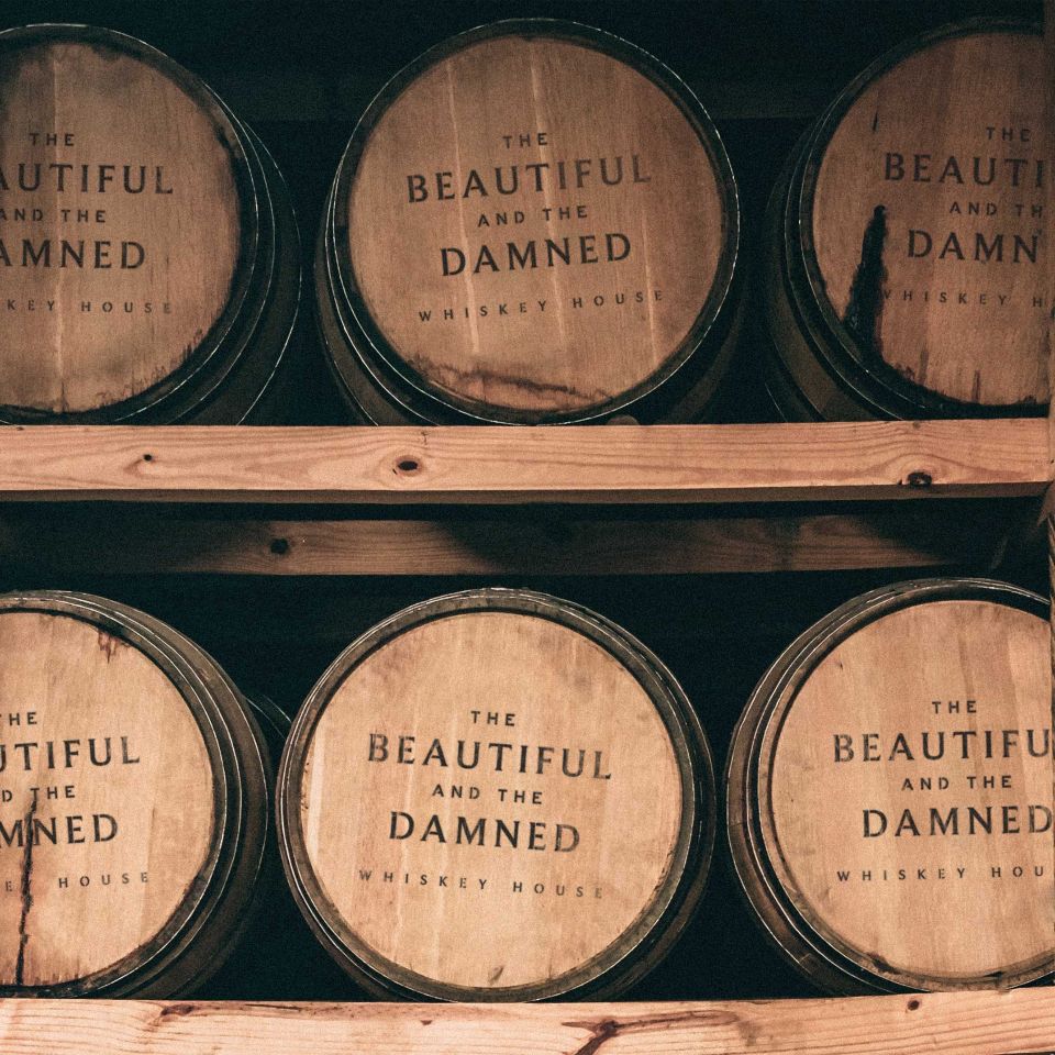
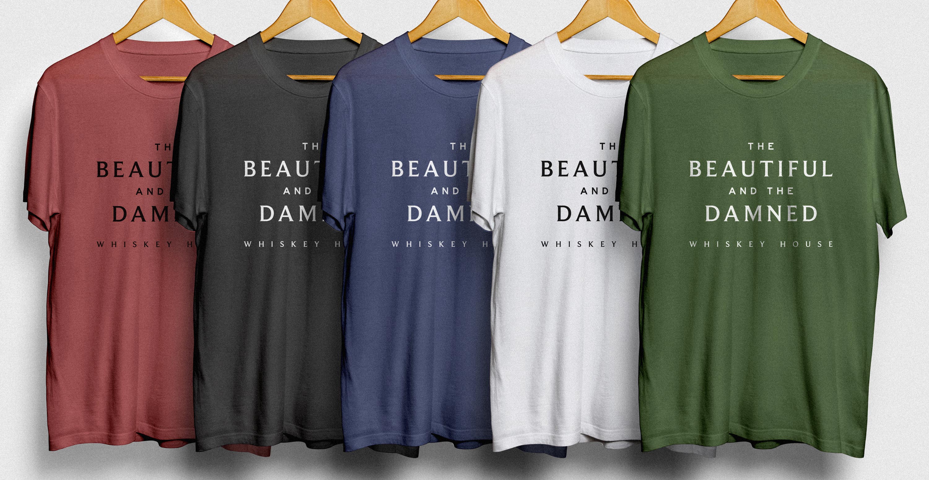
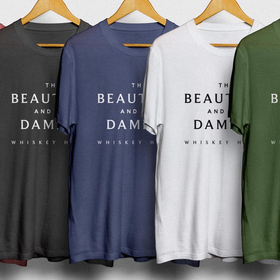
Constructed on a triangular grid and typeset in a mixture of serif and san serif fonts, the Beautiful and the Damned logo is designed to sit strongly at the top of the labels whilst also highlighting the key words and juxtaposition in the brand name - ‘Beautiful’ and ‘Damned’.
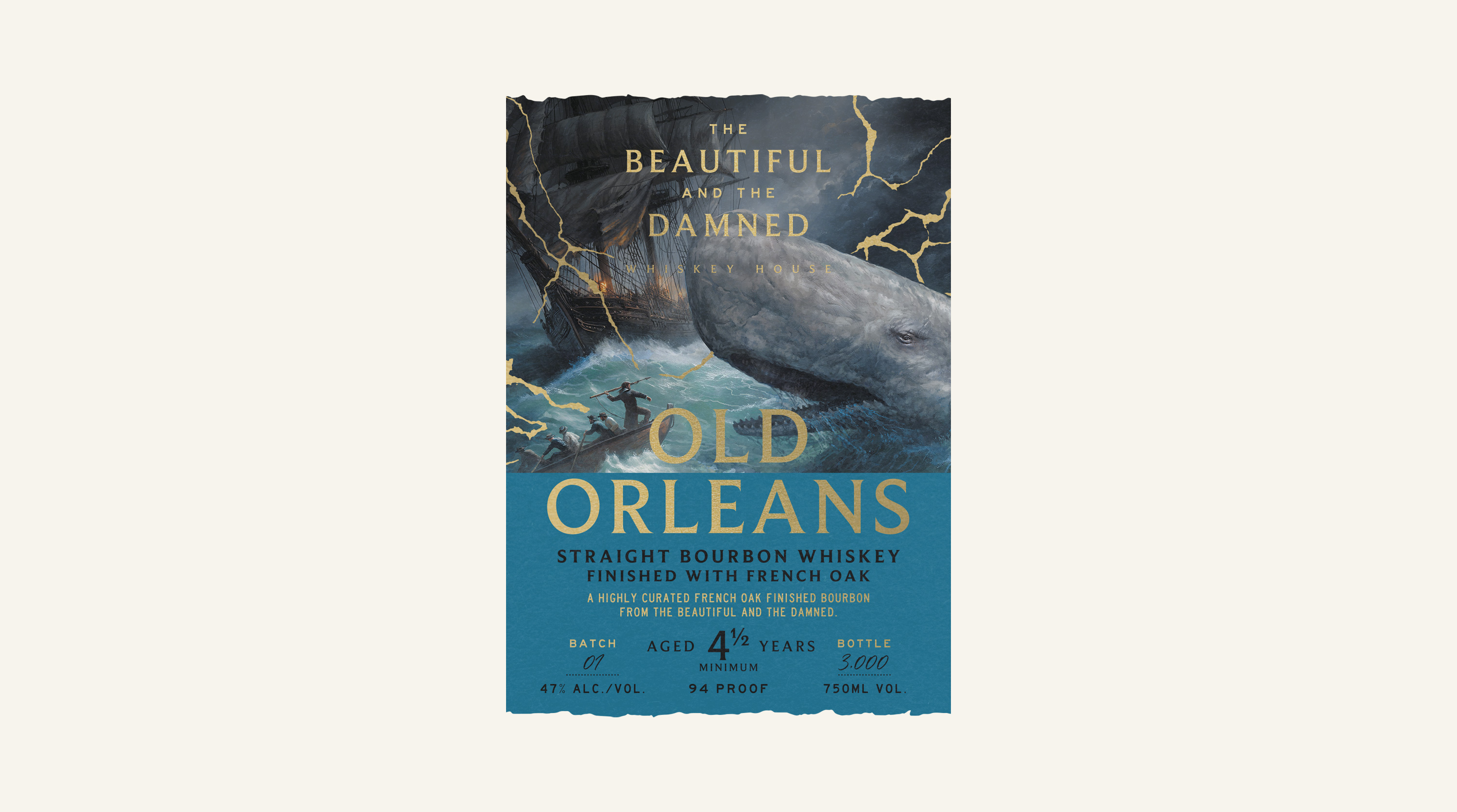
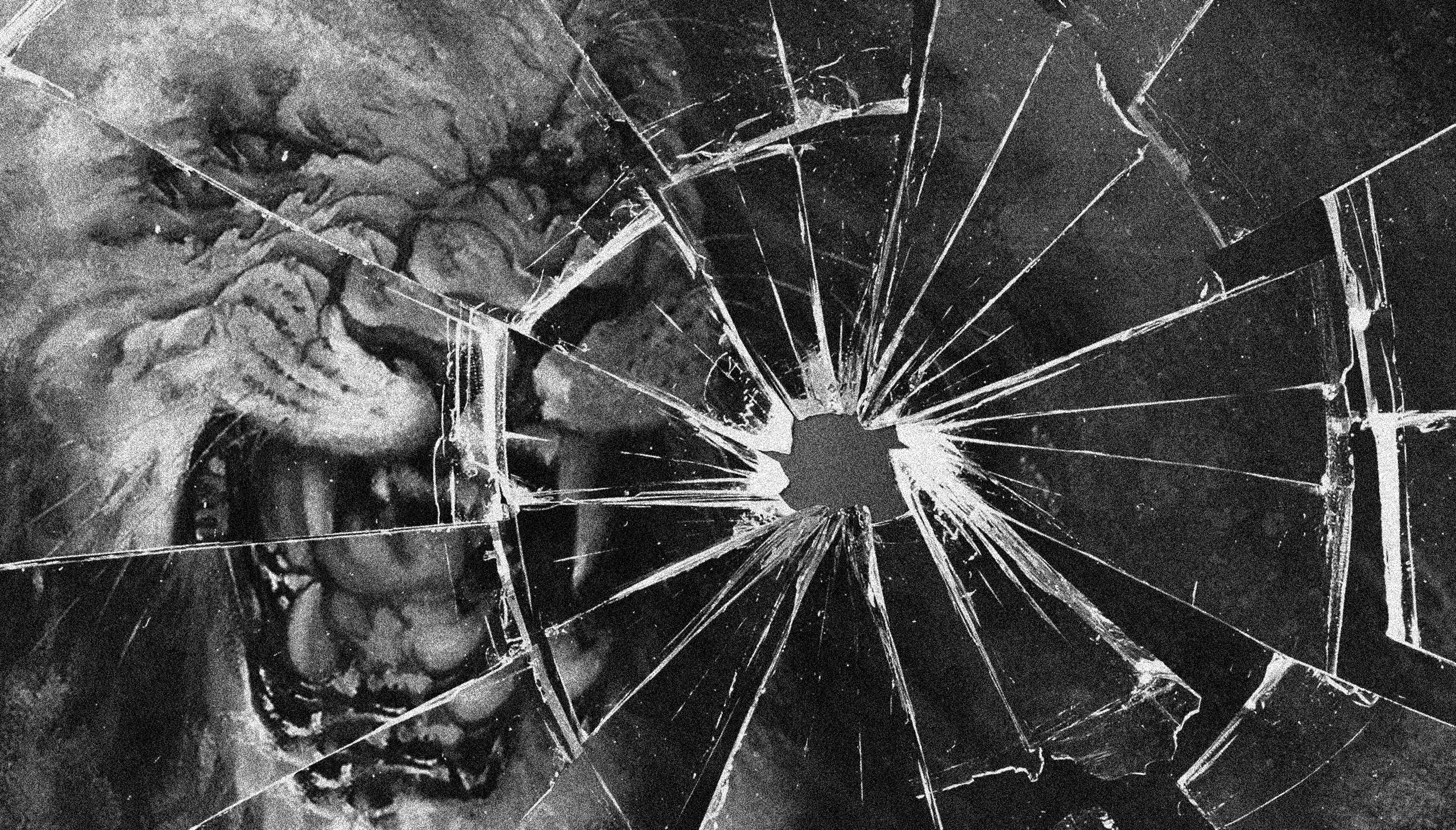
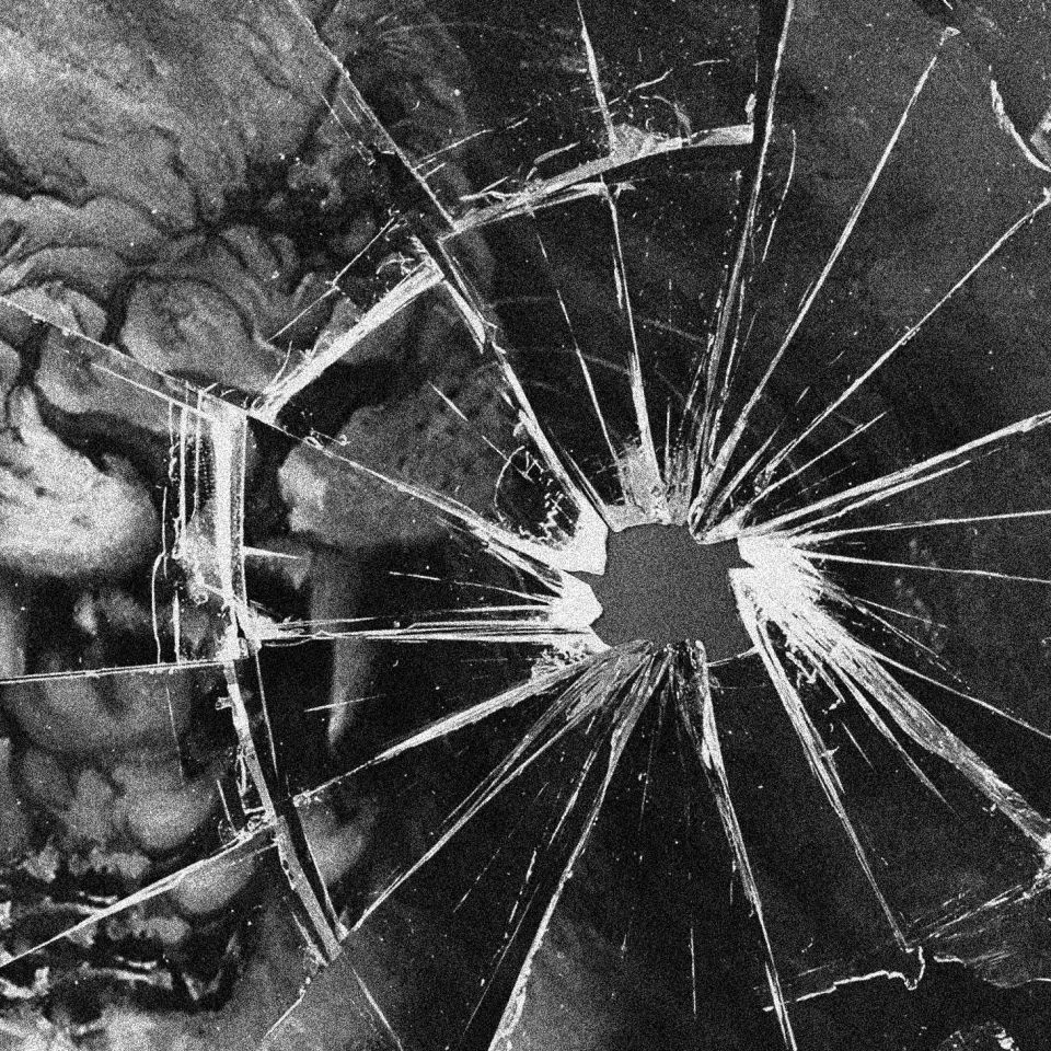
Our concept for the label artworks came from the juxtaposition in the brand name. Inspired by Kintsugi, the Japanese art of repairing broken pottery, we wanted to disrupt the source imagery (the damned) and rebuilt it, weaving in cracks of gold foil (the beautiful), thus bringing in a delicate and luxury touch the label designs.

