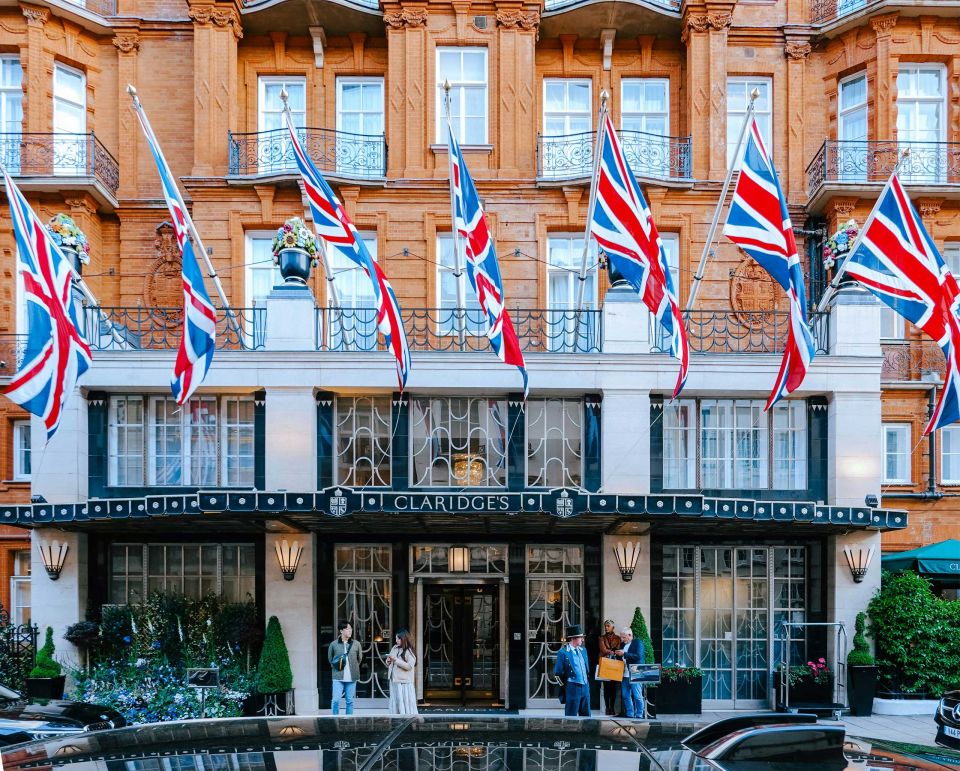
Client
Claridge’s

Category
Design for Print, Label Design

Location
London, England

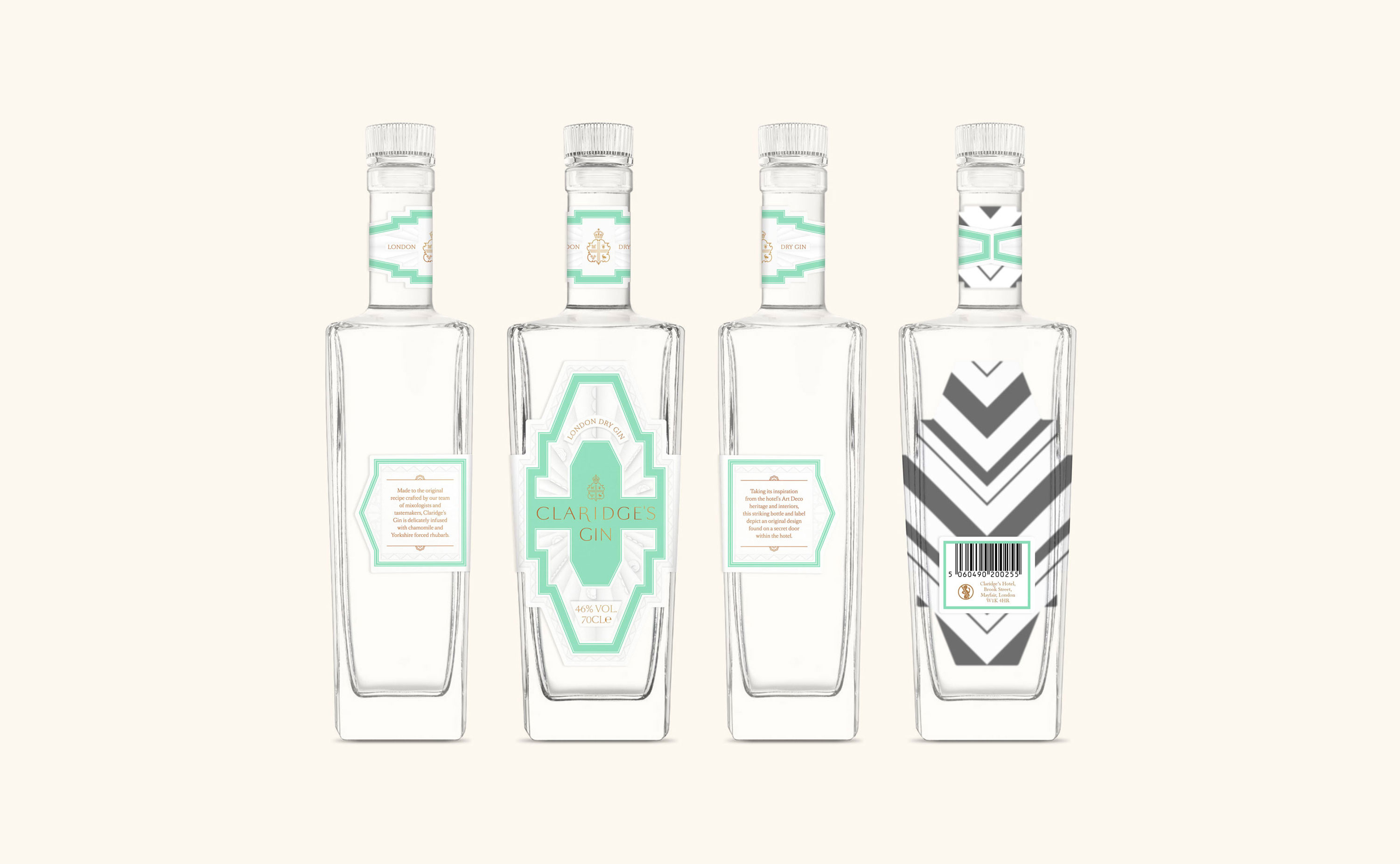
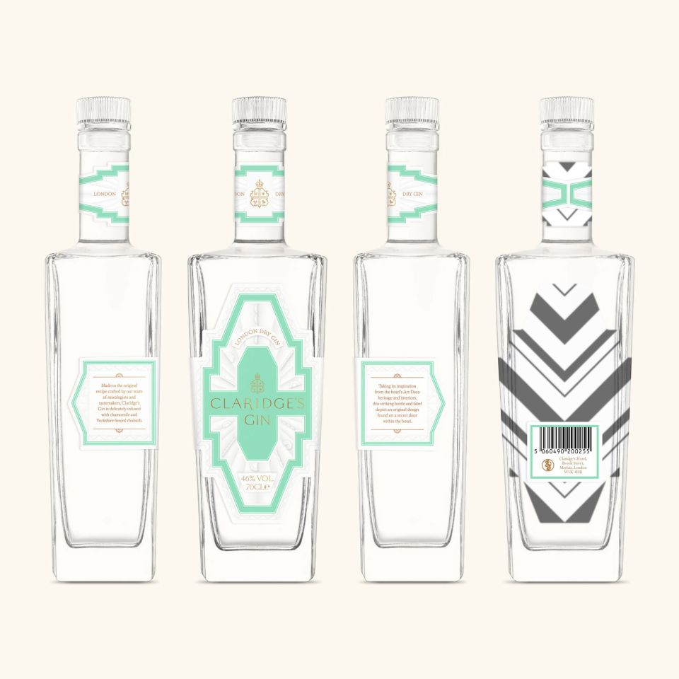
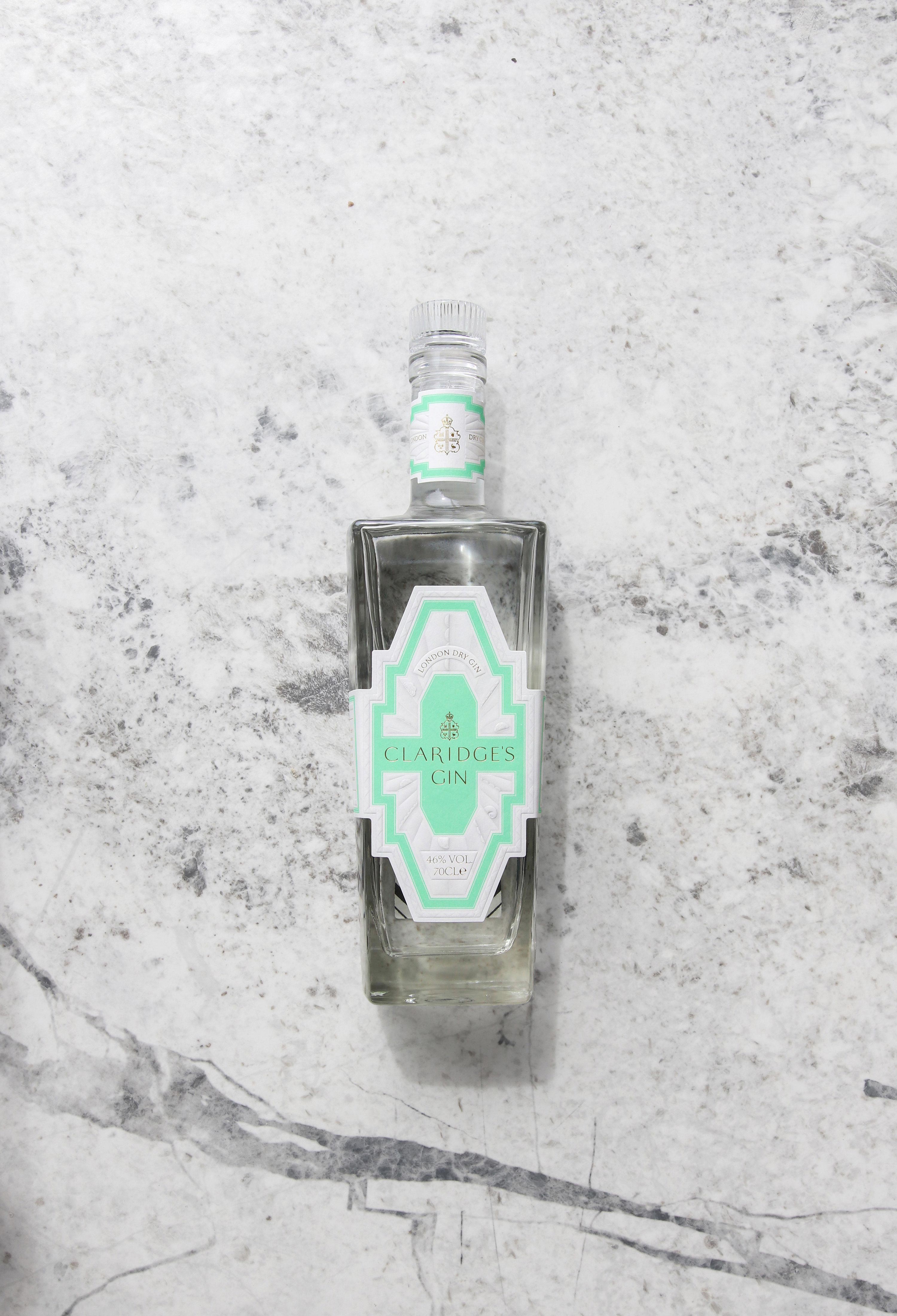
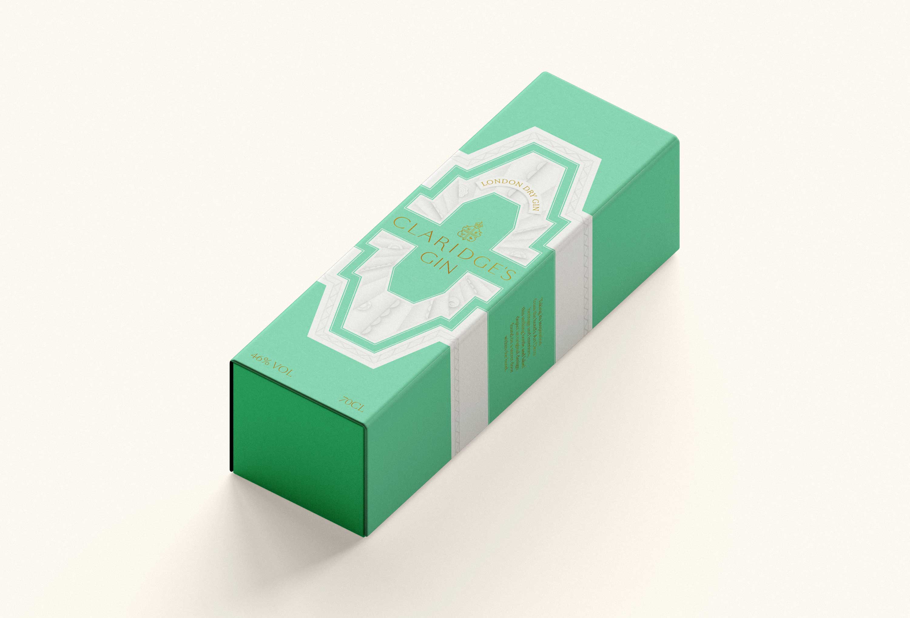
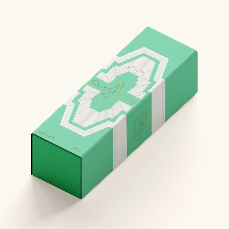
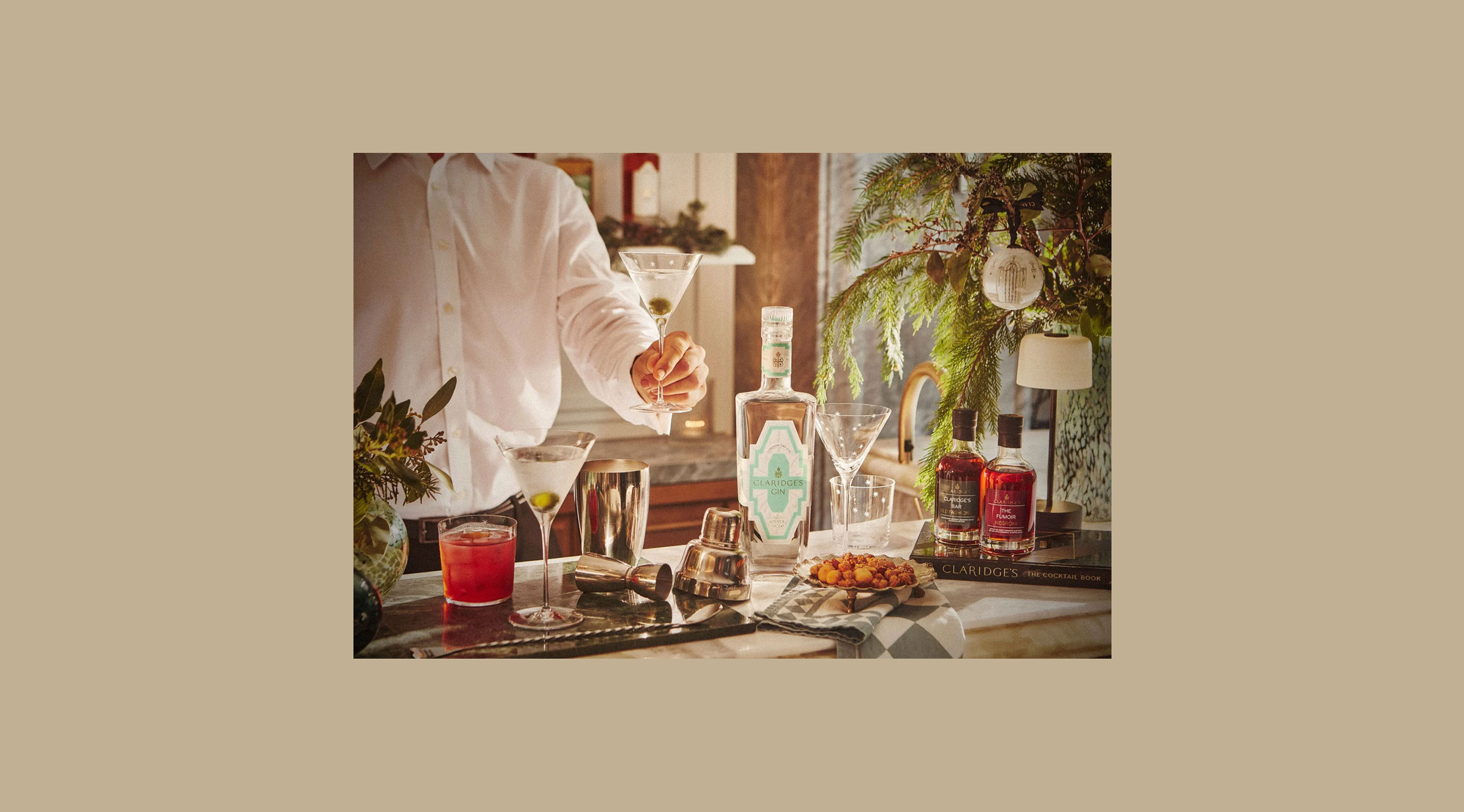
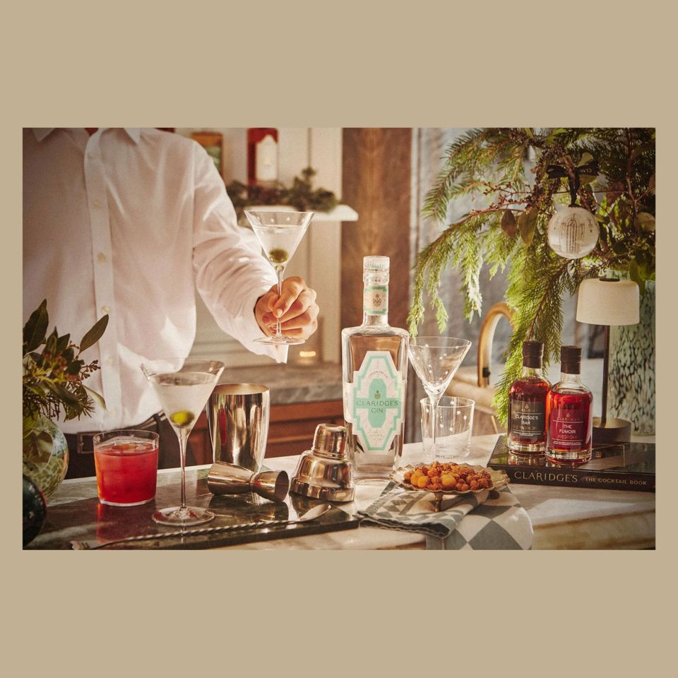
Opened in 1856, Claridge’s is one of Londons oldest and most prestigious hotels. We worked with the team there to design a label set for their first gin, taking inspiration from the famous art deco interiors.

UC-claridges-02

Deep in the corridors of the hotel we discovered an original cast iron door featuring an incredible art deco relief. This art piece formed the basis for our design - informing the unique shape of the label and providing the illustrative details which were further enhanced with a bespoke multi-level contour emboss.

UC-claridges-04
UC-claridges-05
UC-claridges-05
UC-claridges-06

Working closely with tool makers we designed a bespoke multi-level contoured emboss that adds depth and tactility to the label. The visual effect is further enhanced with subtle printed shading, highlighting the art deco forms and decorative shapes on the label.

UC-claridges-08
UC-claridges-08
UC-claridges-09
UC-claridges-09
UC-claridges-10
UC-claridges-10
Next/Prev Colour