Client
Bury Council
Category
Environmental Branding
Location
Bury, Lancashire
Working closely with architects Hawkins\Brown, United Creatives were appointed to conduct an Environmental Branding study for the Greater Manchester market town, Bury.
Our ideas and insights were compiled into a book that serves as both a framework for arts practitioners and a guide for integrating relevant visual signatures into the work of landscape architects and architects.
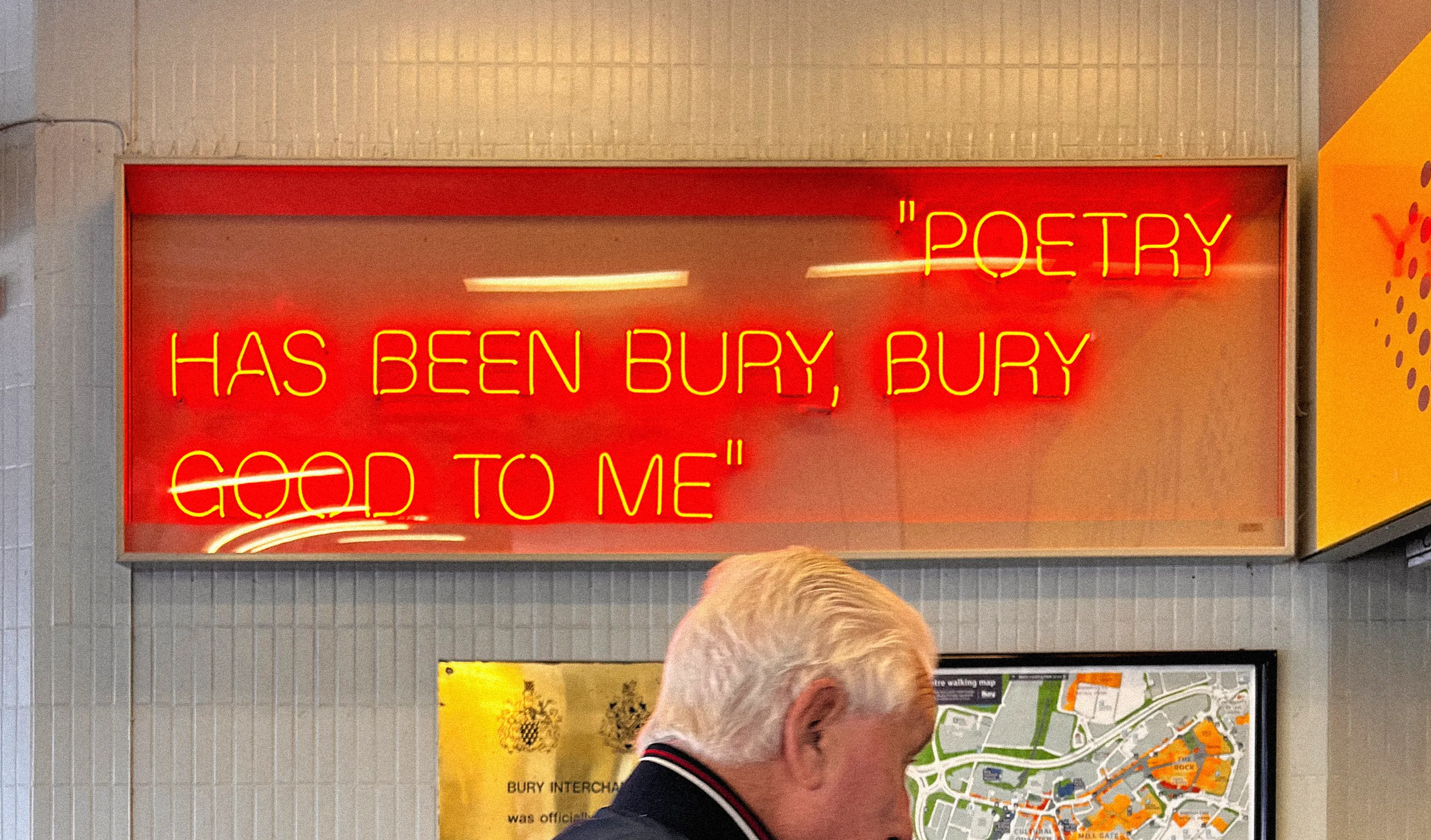
Our goal for the project was simple: let's celebrate what makes Bury, Bury.


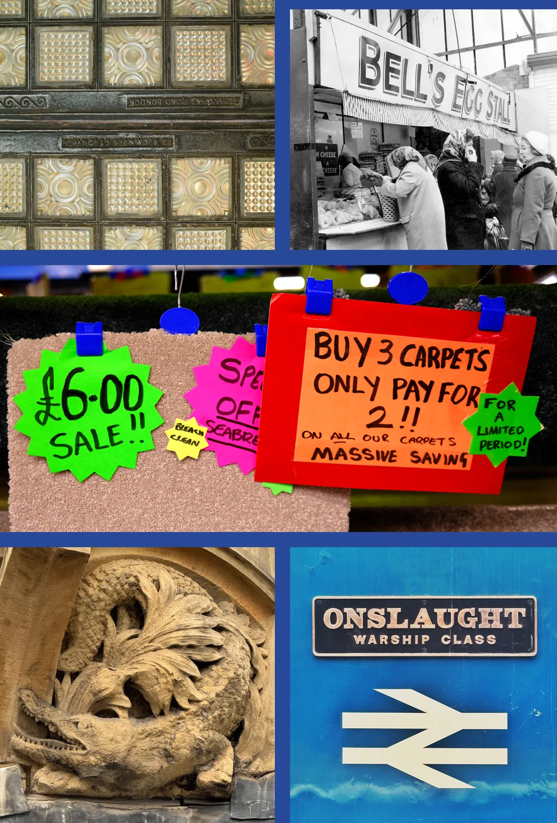


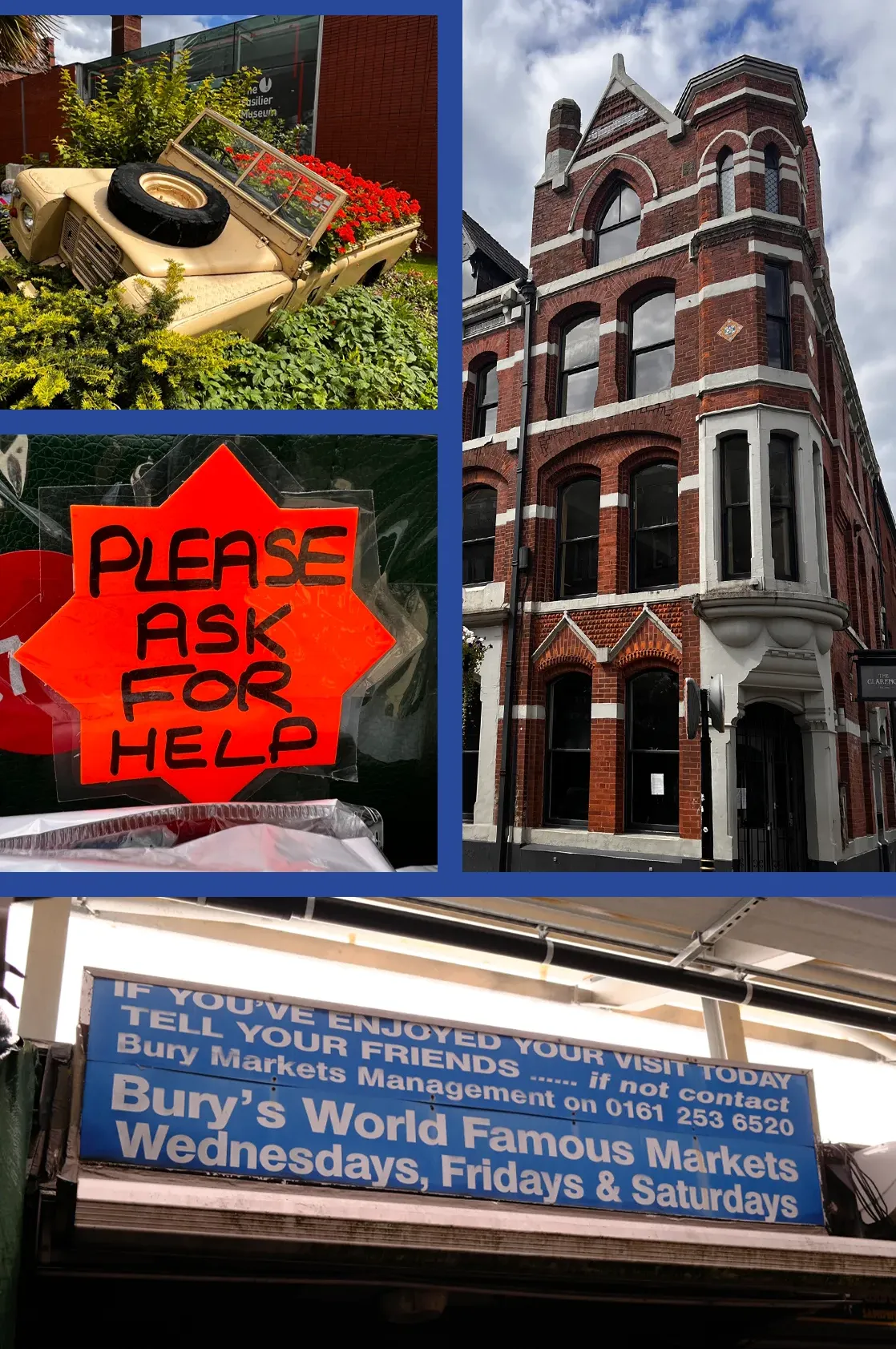
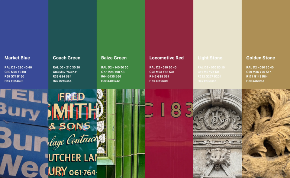
Summary of Colour
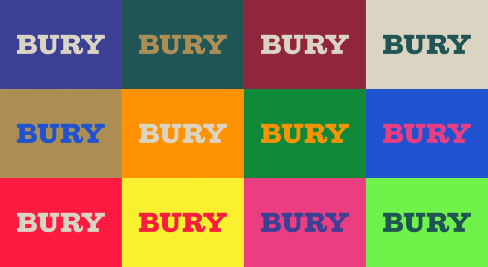
The palette of twelve colours for Bury town centre has been directly influenced by and sourced from Bury itself reflecting both its heritage and contemporary character.
Consisting of six core heritage colours that can also work as tints, it is complemented by a supporting range of solid brighter, more contemporary tones.
Together, these colours provide a consistent framework to guide design decisions across artwork, architecture, landscape architecture, wayfinding and shopfront signage.



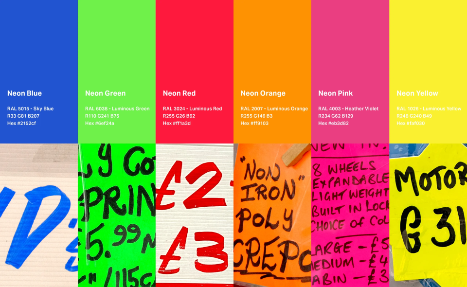
Patterns of Bury
Also included in the book is a range of vector-based patterns that take direct inspiration from the town. From architectural signatures to the recognisable awning stripes found across the market, these patterns are key to communicating the unique visual language of Bury.
Embedded hyperlinks in the book allow the user to download these as vector graphics and integrate them into design and landscaping projects, helping to create work that has local relevance and celebrates place.
Market Stripes
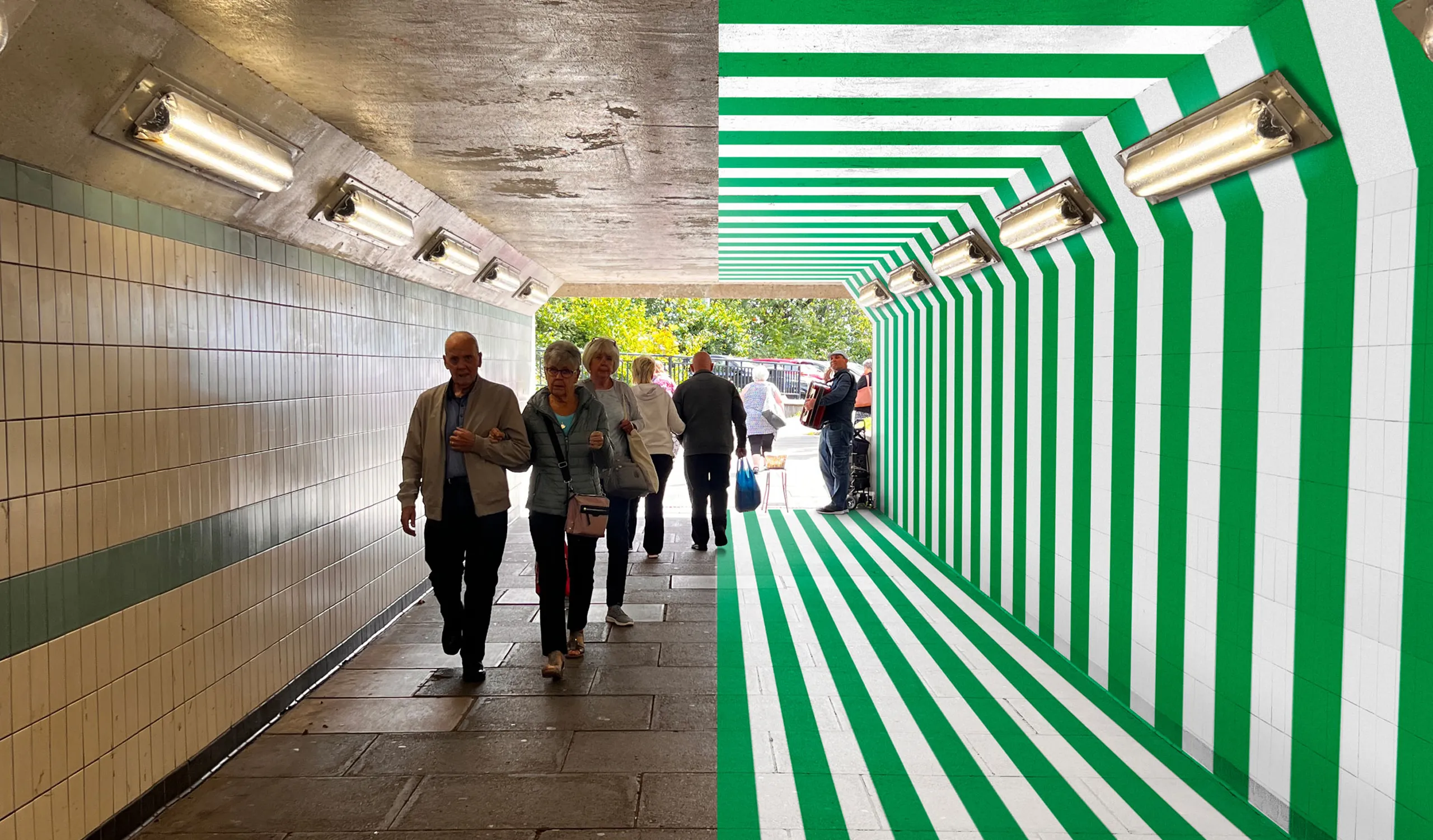
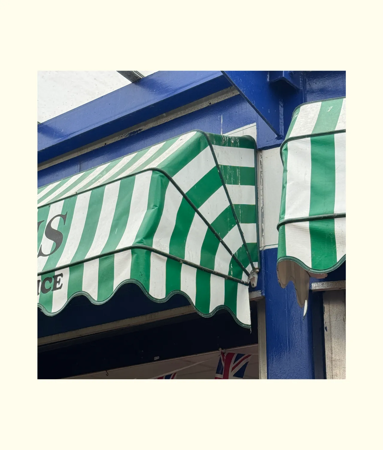
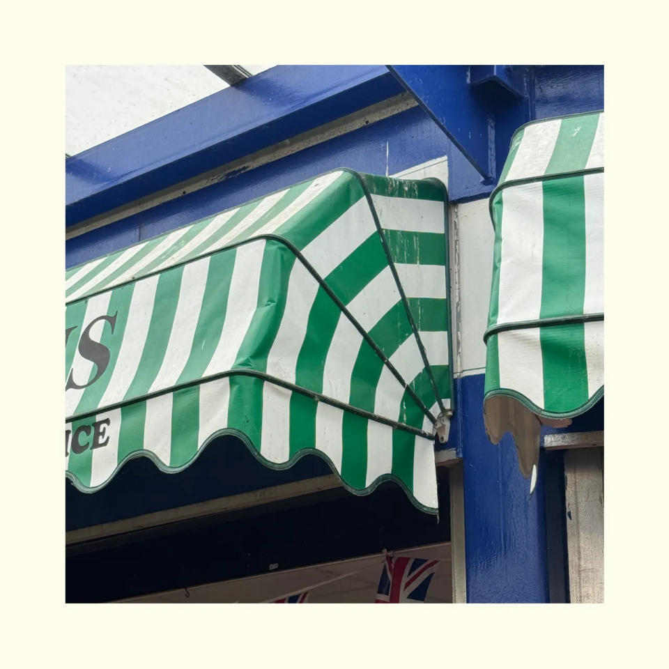
Striped market awnings are an iconic feature of Bury town centre and market, their bold bands of welcoming colour and distinctive wavy-edged valances provide shade and shelter to stalls and visitors.
Part of Bury’s DNA, these devices can form the edges of shared surface public realm, add visual interest to street furniture and provide design source materials for arts commissions or pedestrian guidance.


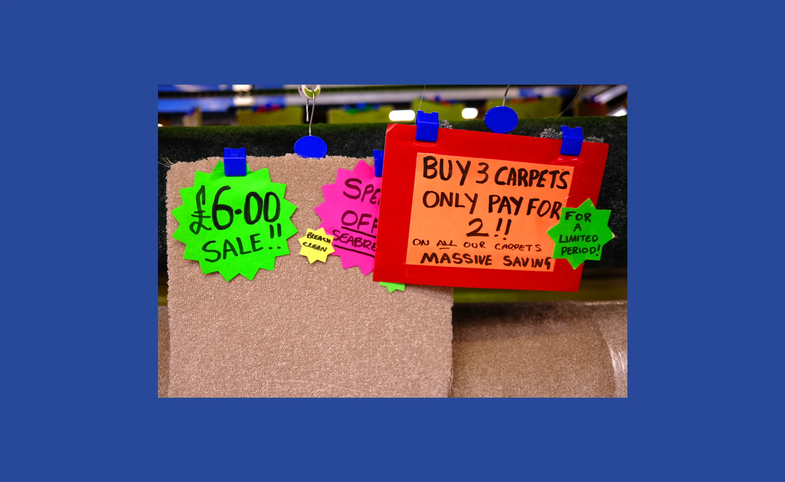
Neon Star Bursts
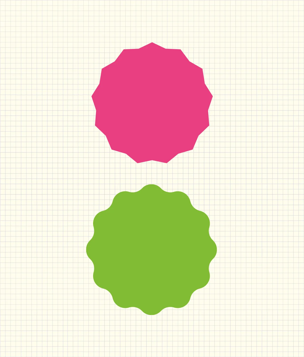
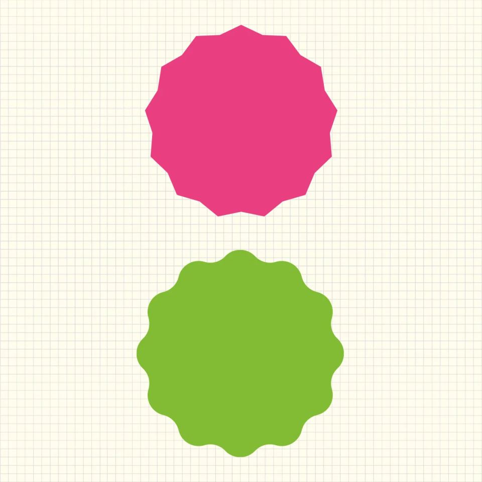
Friendly, super colourful snippets of information, neon star bursts grab attention and have a unique language synonymous with Bury. Using this unique and contemporary geometry and colour within the public realm will deliver bold shapes, a basis for improved market wayfinding as well as arts commisions.


Architectural Signatures
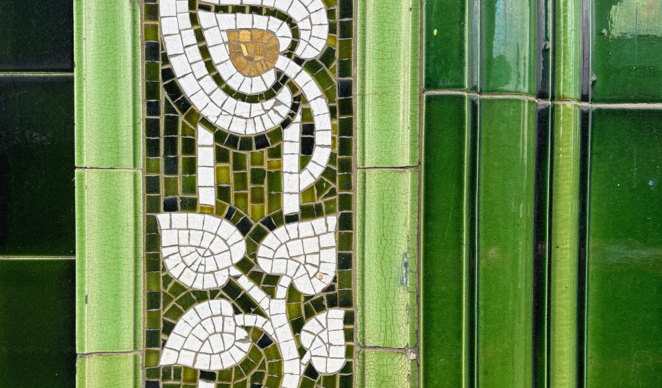
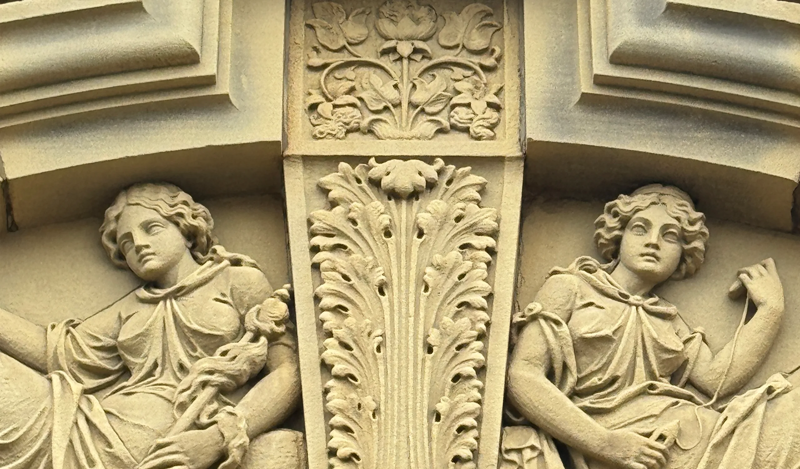
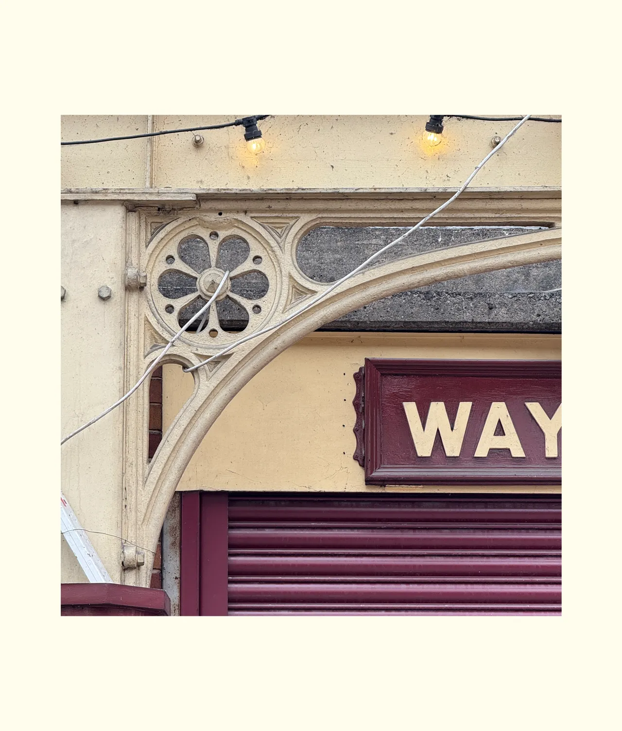
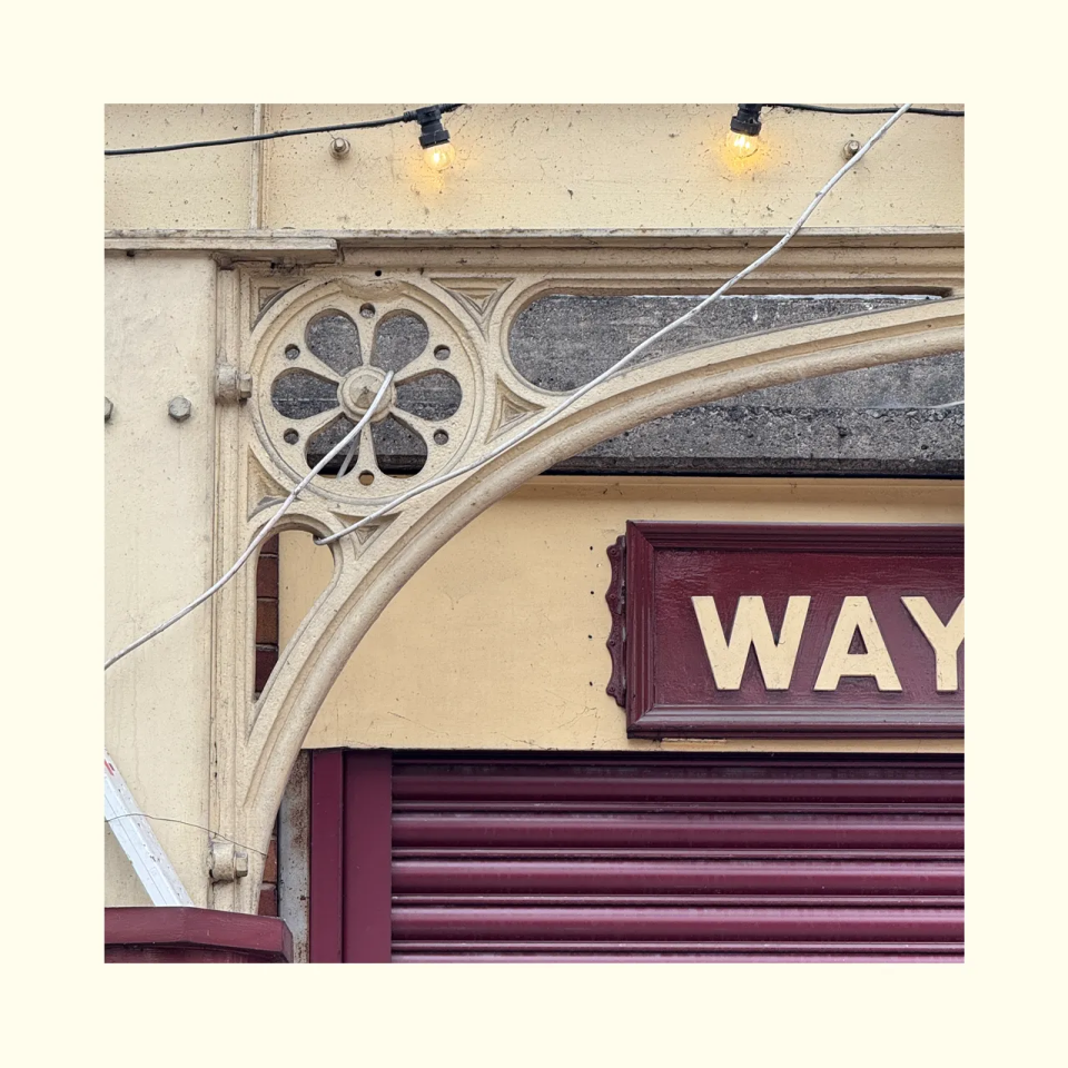
The identification and application of Bury’s architectural signatures provides a framework for embedding the town’s historic character within new public realm.
Drawing upon a range of vernacular forms, many recurring motifs are embedded in the civic architecture and can be celebrated by being used in new comissions, be they built, landscape or arts based.


Heritage Railway Plates
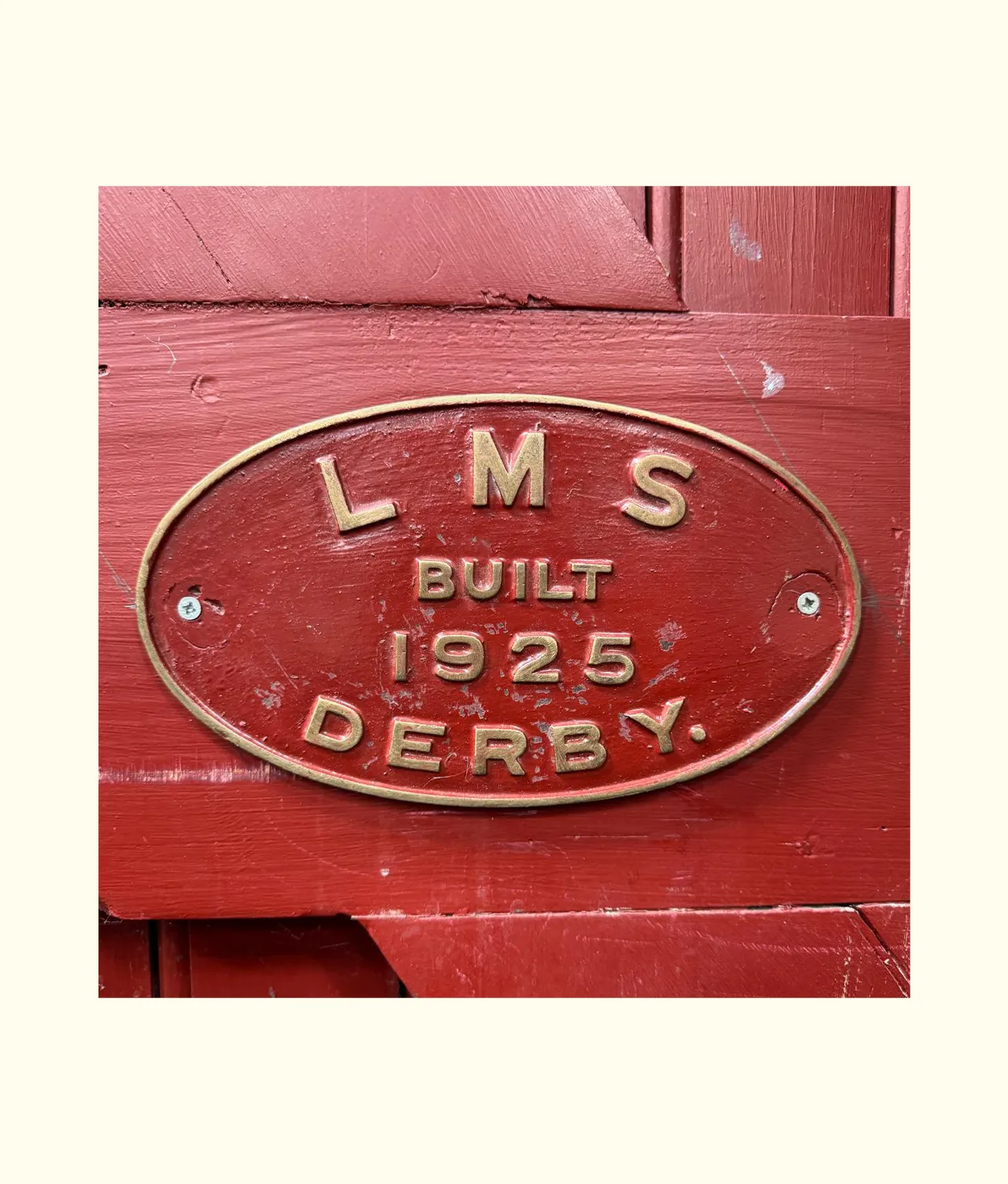
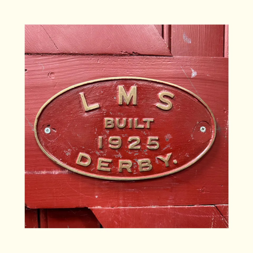
First opened in 1846, Bury’s Bolton Street railway station is an icon of the town and is today home to the much loved East Lancashire Railway. Across the road from the station we find the Bury Transport Museum, a celebration of historic vehicles and the railways.
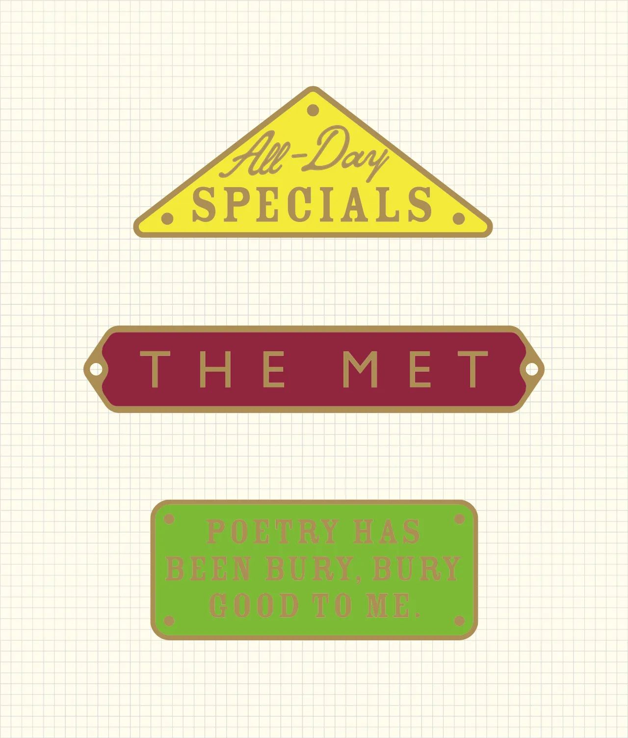
Used across the town these plate shapes can form the basis of a new wayfinding scheme for street name signs or become the inspiration for a public arts project. Displaying the unique language of the Bury whilst celebrating the visual language of East Lancashire Railway and Bury’s historic transport links as art.


Arts, Crafts & Local Business
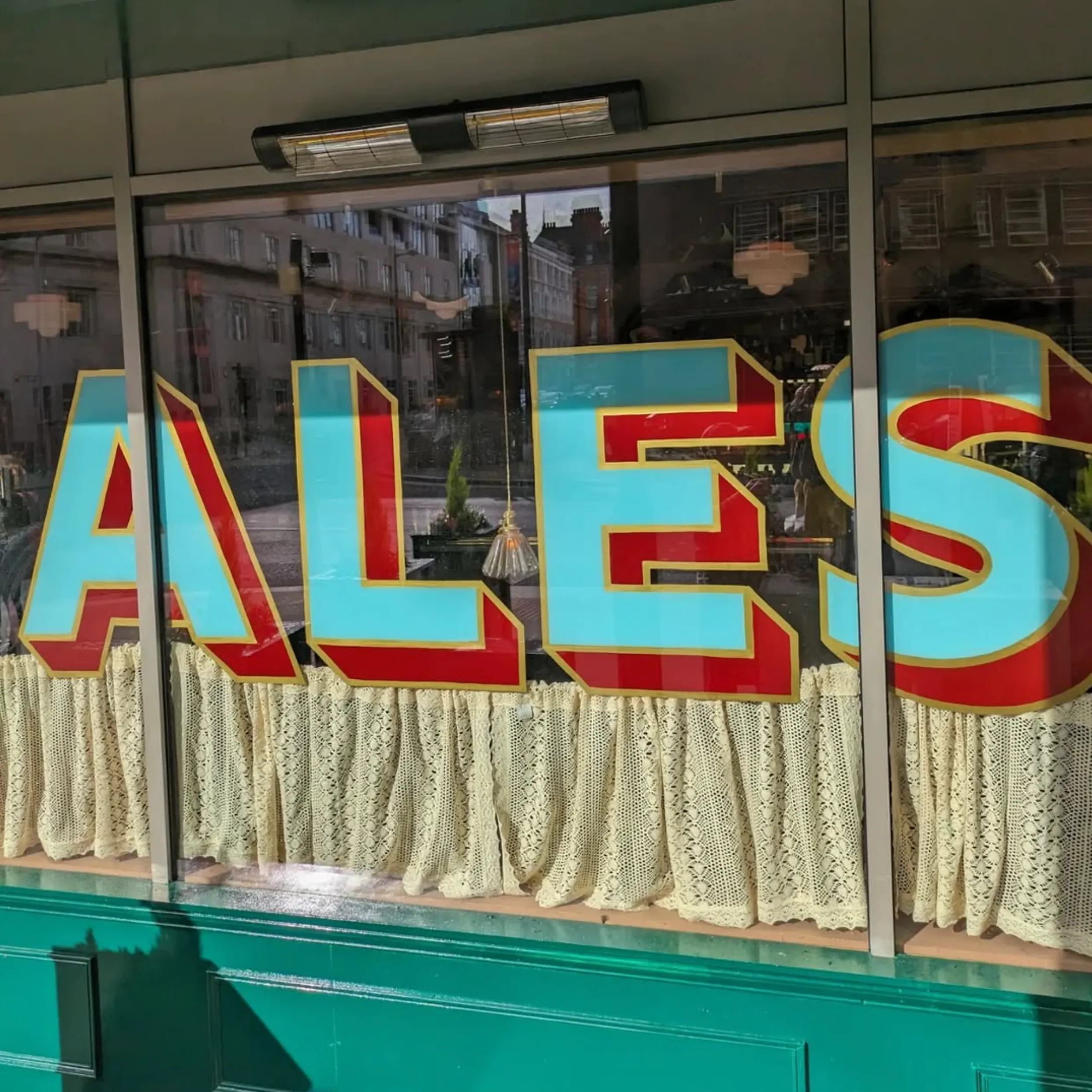
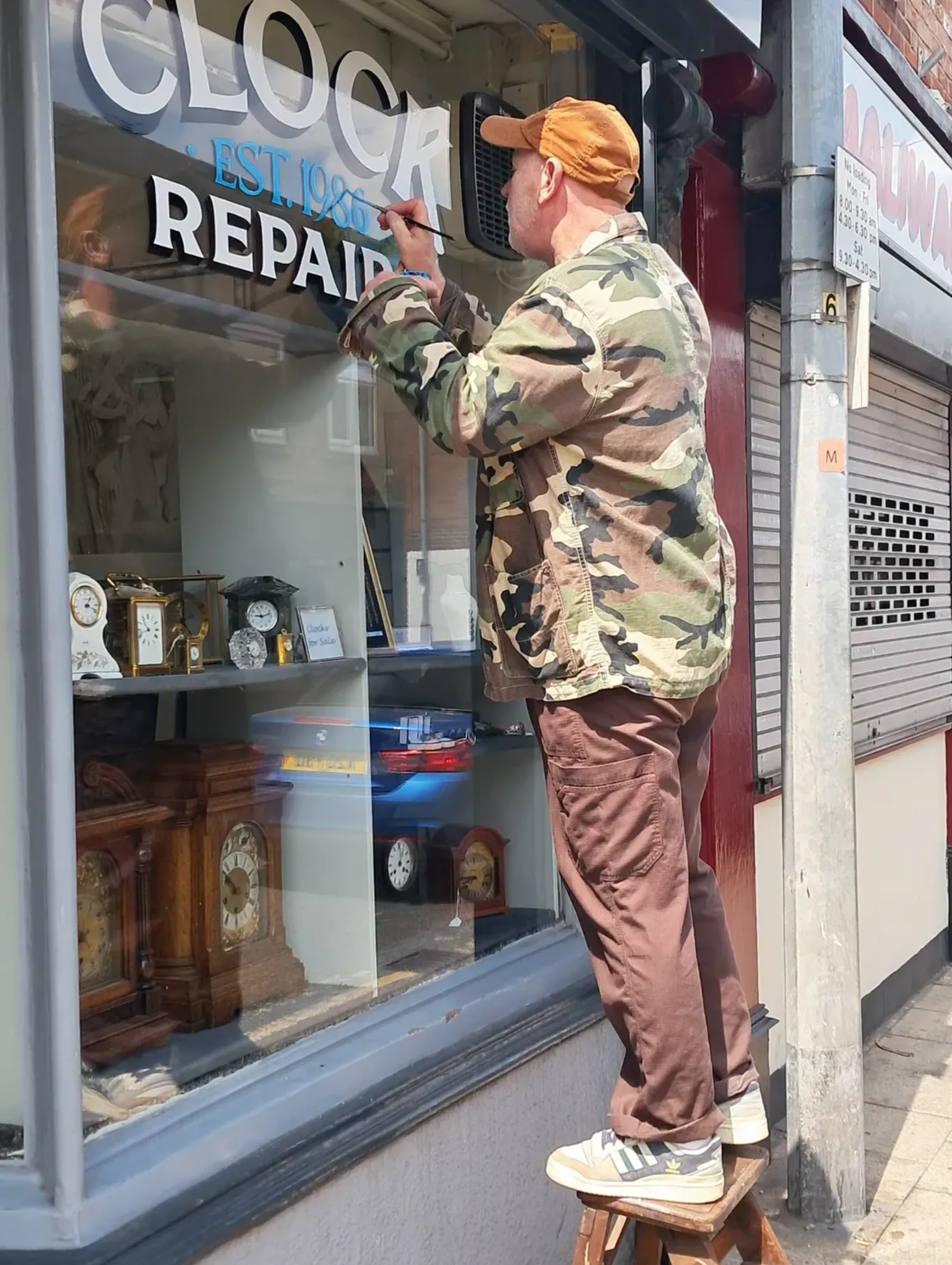
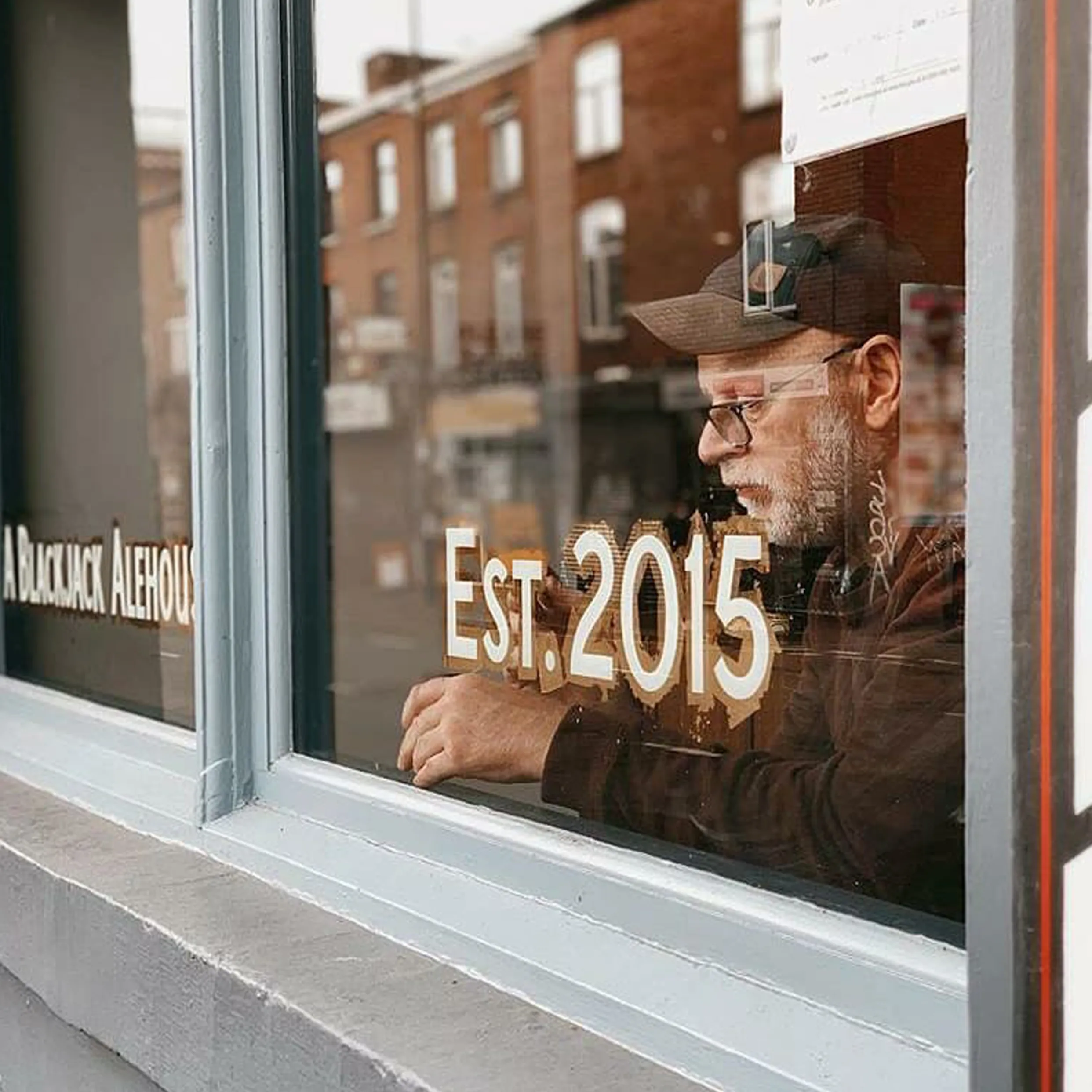
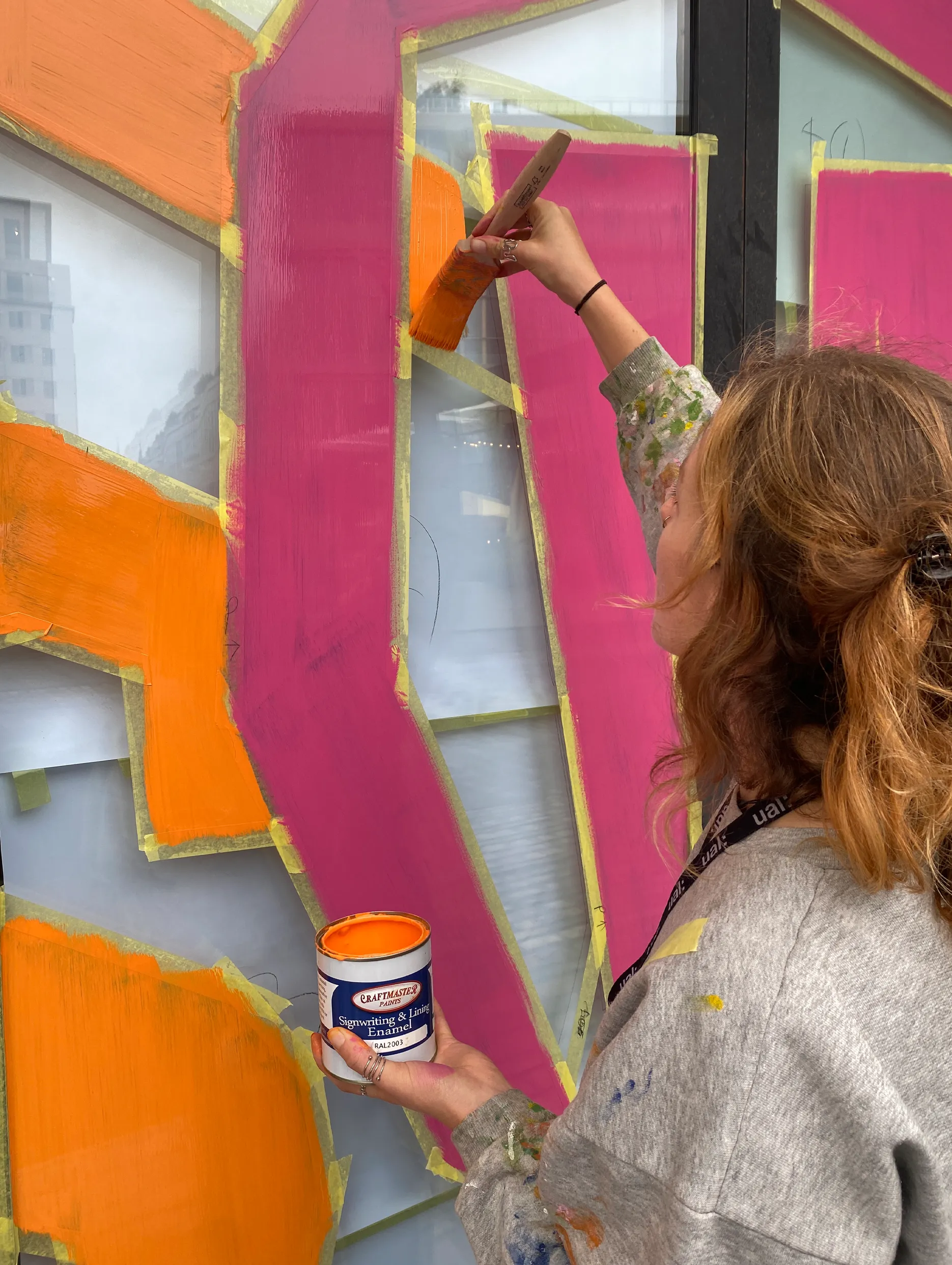
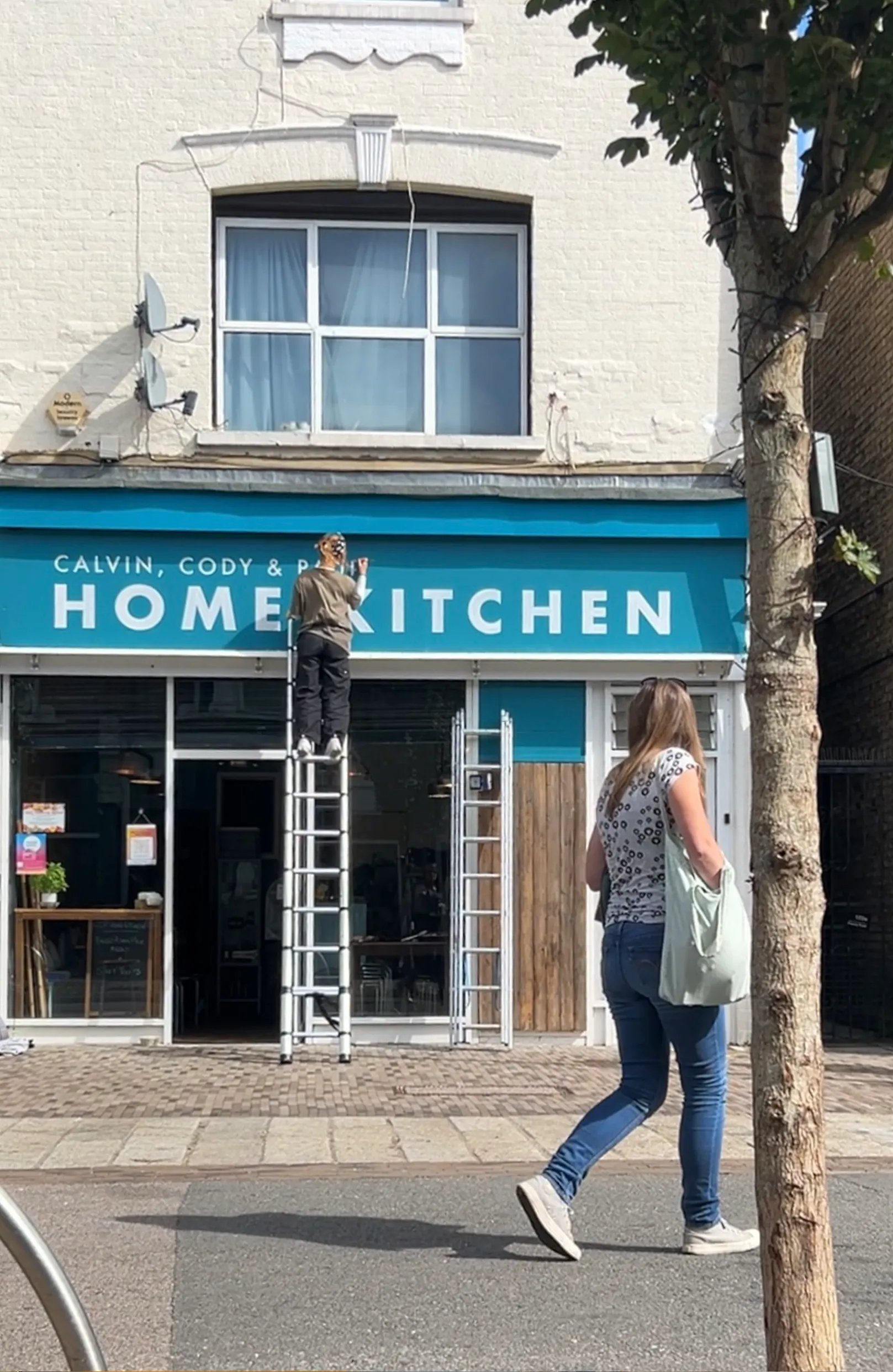
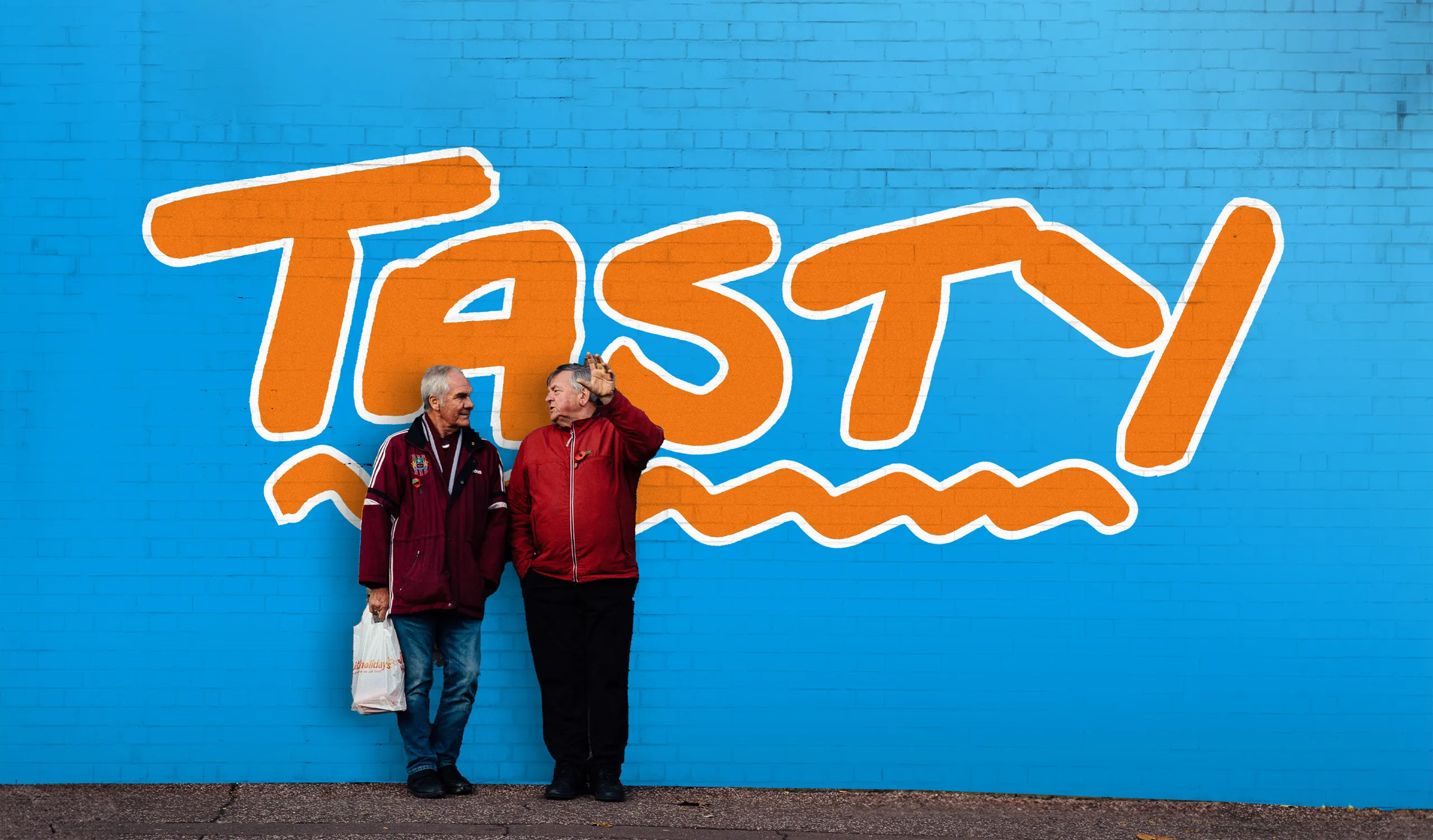
Bury’s town centre is currently dominated by a host of cheap plastic signage and vinyl lettering, a distinct shouting visual clutter that works as a detriment to the town’s identity.
By working to replace this with hand-painted signs, we can restore artistry and pride to the high street. This revival is about adopting relevant living heritage and colours that respect Bury’s identity whilst allowing surrounding architecture to breathe.