Client
Peek Frean & Co.
Category
Brand Identity, Packaging
Location
London, England.
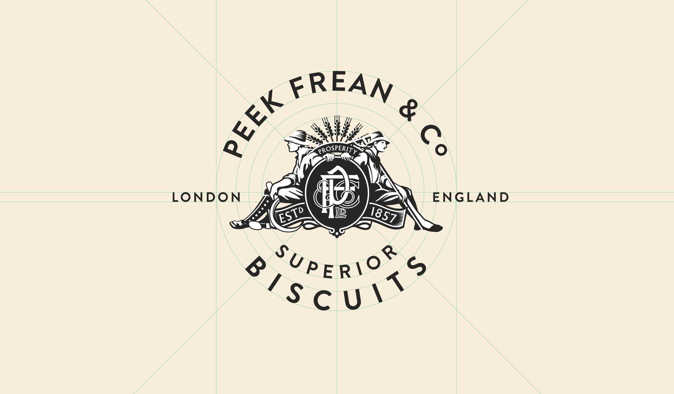
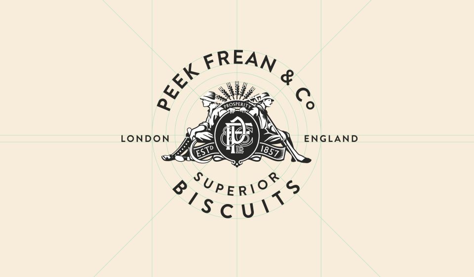
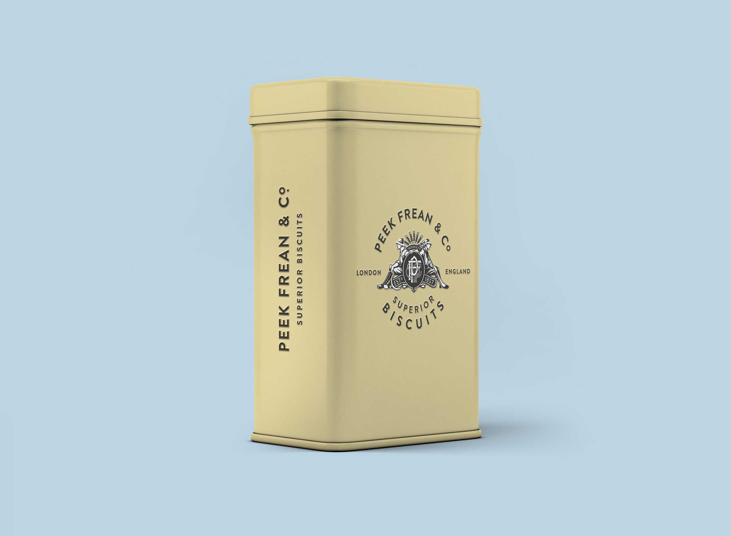
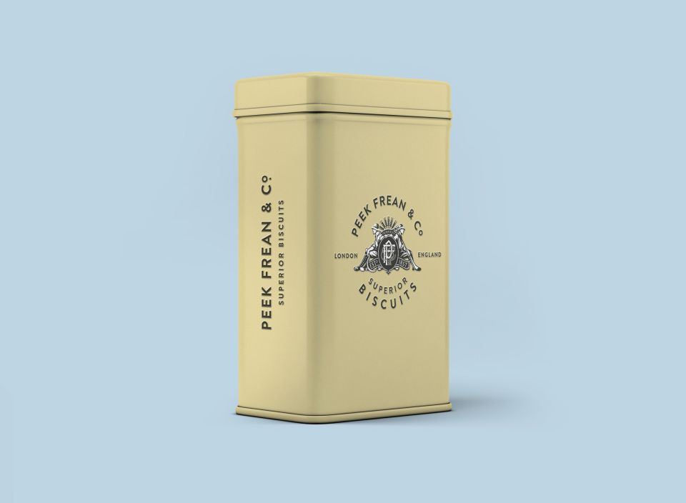
Working closely with De Beauvoir Deli, we developed an illustrated brand identity, a resurrection project for the great and mighty Peek Frean company, once the world's largest maker of biscuits formed in 1857.
The resulting logo is based on a vintage illustration by Mancunian illustrator Alan Tabor, which we discovered during a research visit to examine the brands historical archive.
By reducing the number of colours and simplifying the fine hatch shading, we made the logo suitable for use in contemporary markets across a wide range of products.

Referencing Brand Heritage
Working through a huge historical archive dating back to the 1860s at the Biscuit Museum of Bermondsey, we reviewed a variety of vintage brand ephemera that helped to inspire the resulting logo. From posters to biscuit tins, we took inspiration from the composition of circular type lock-ups and meticulously crafted, hand-drawn illustrations.