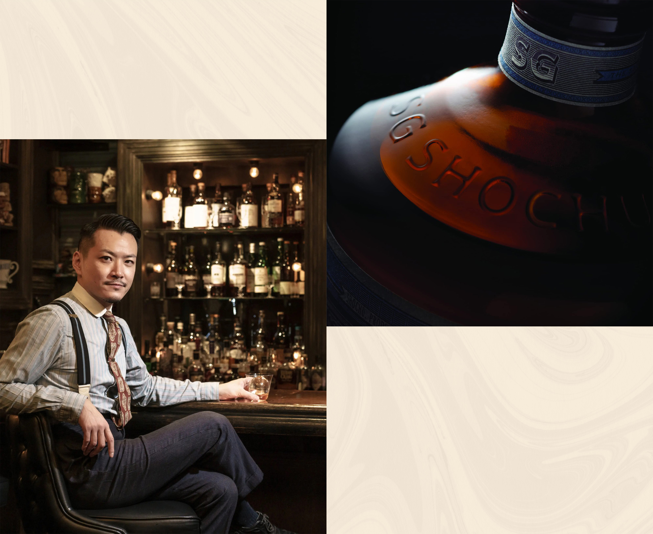
Client
Shingo Gokan
Category
Packaging, Brand Identity
Location
Japan
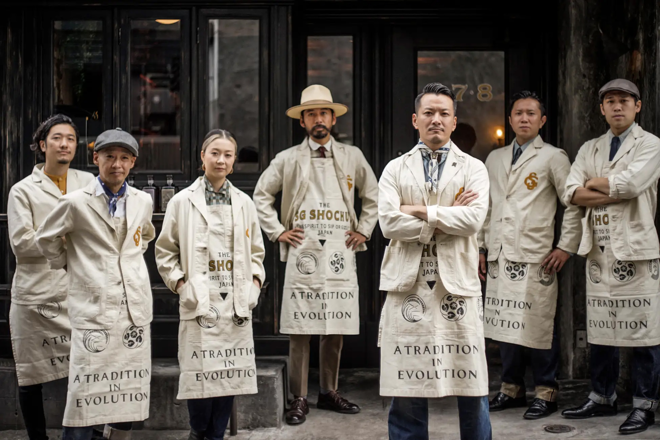
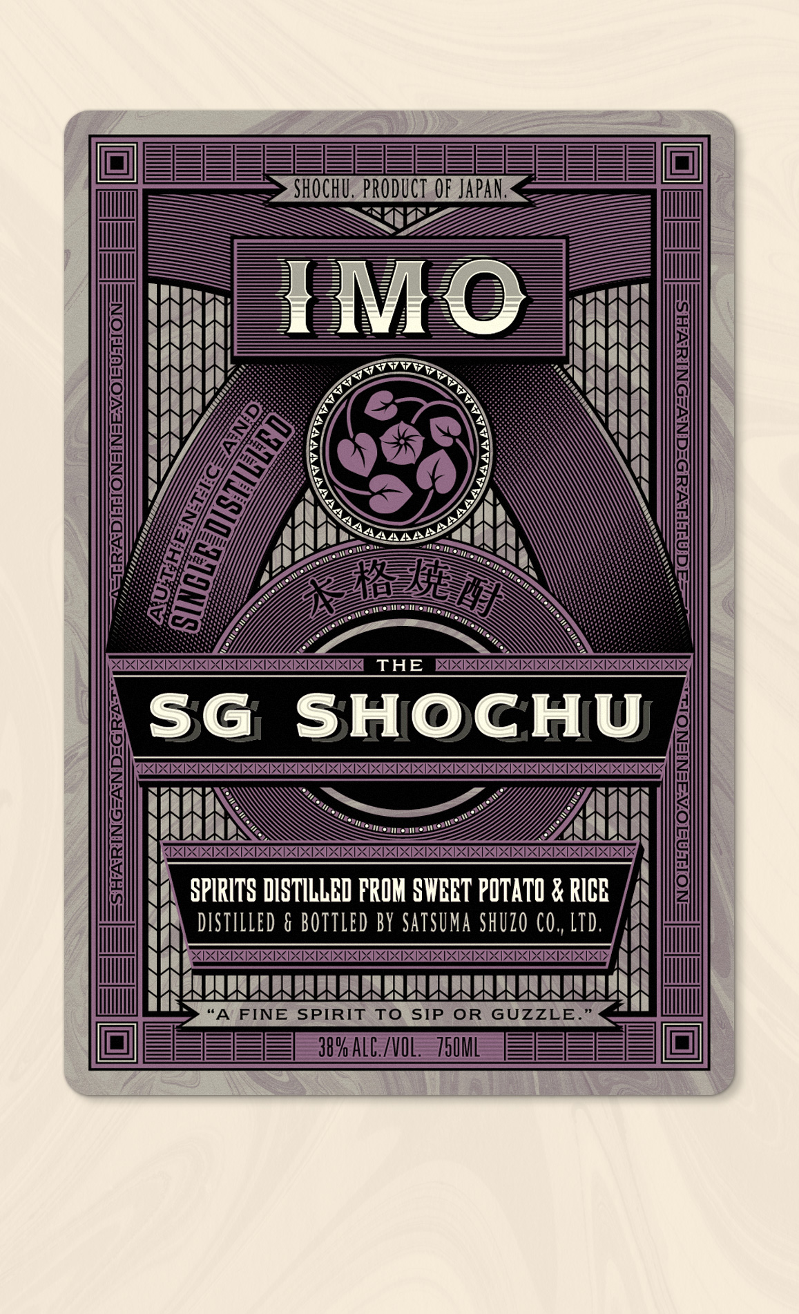
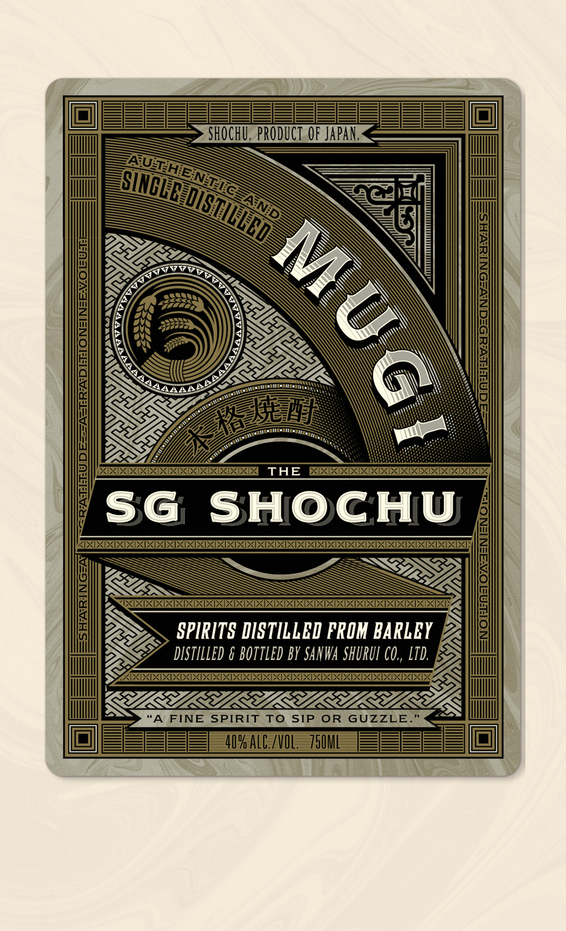
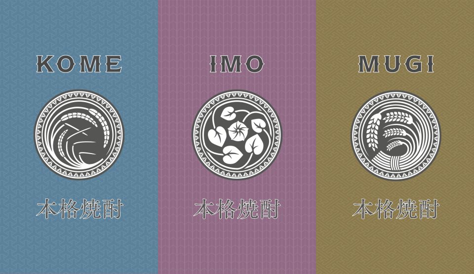
Working closely with the leading bartenders in Japan, we fused vintage Japanese visual culture with London Victoriana to create a brand for a traditional Japanese liquor named Shochu.
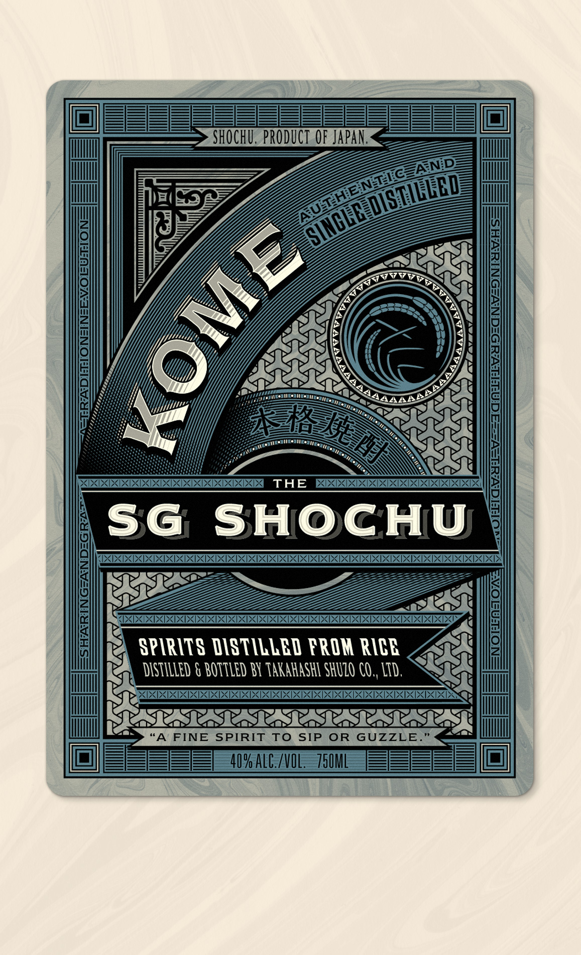
The resulting gaslamp approach to label design was prompted by vintage graphic design before the category graphic design even existed. Shading was achieved by line shading with the illustrative assets stemming from historical visual culture in Japan, like an early litho printing showing the world what they can do.

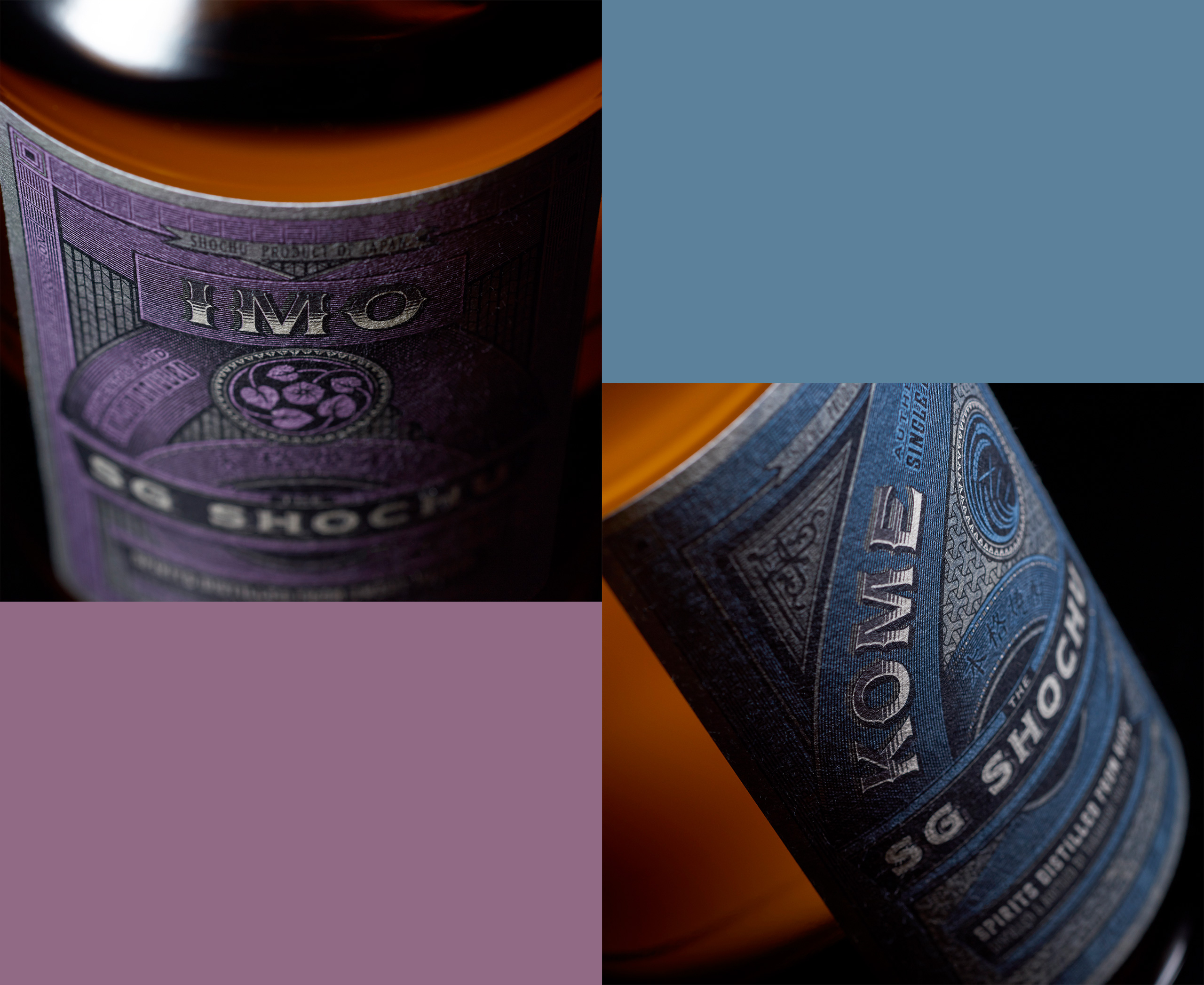
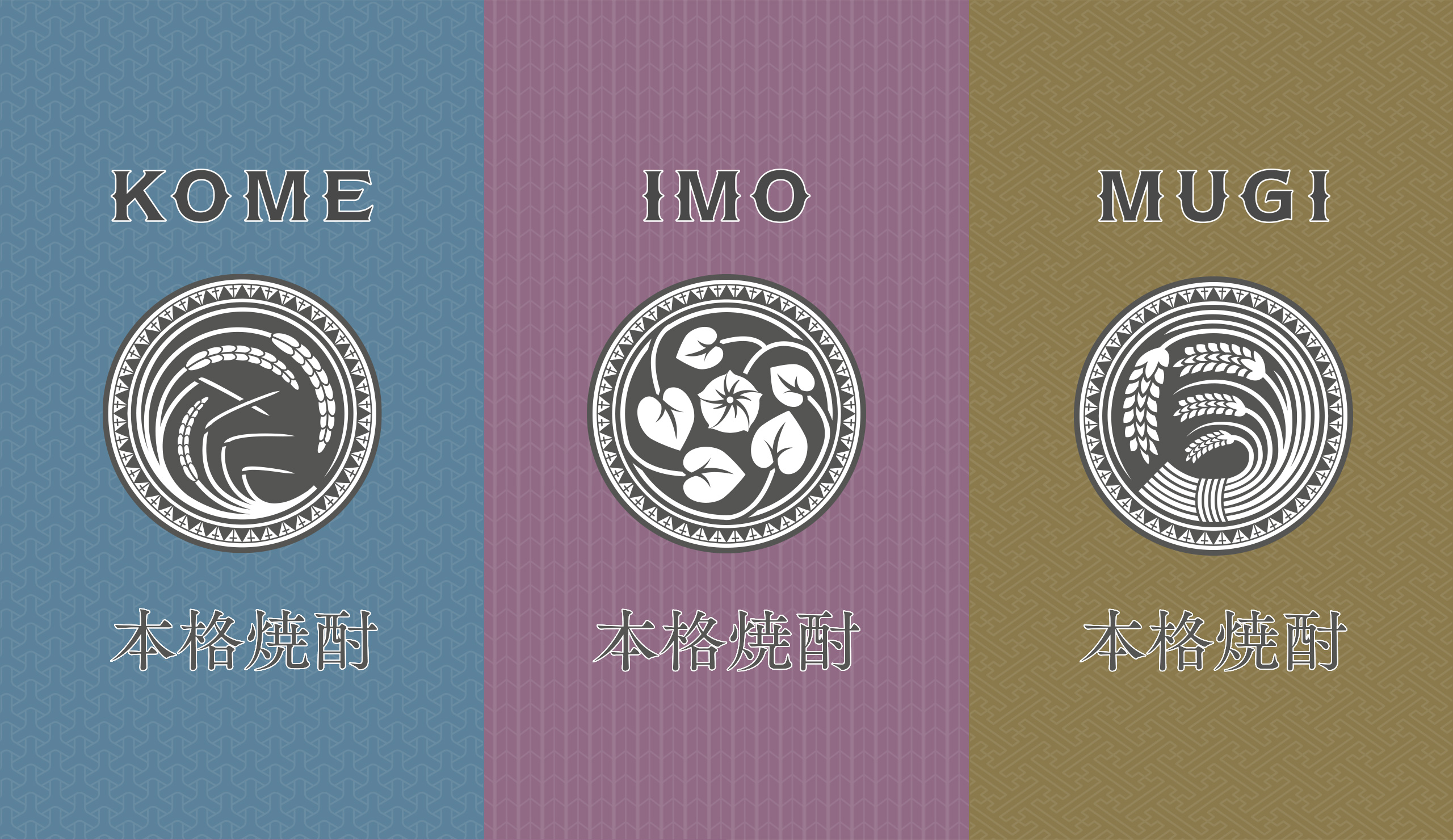
Billed as a fine spirit to sip or guzzle we designed a trio of labels that work as a family with intricate attention to detail and balance within the design. Printed using flexography the inks are carefully overprinted and built up to include layers of kimono patterns, references to local area farmer-makers and traditional Japanese paper marbling taking inspiration from suminagashi master Tokutaro Yagi.

As well as the label trio we also art directed the SG Shochu dot com and worked closely with both print teams and client group producing giclee pre-press proofs, shipping cases, cartography and off-pack assets. We even had our hand in a haiku; gratitude is the gift, now resting in your hands, a tradition in evolution, waiting to be shared.