Client
Tameside Metropolitan Borough
Category
Environmental Branding, Street Furniture Design
Location
Stalybridge, Greater Manchester
What is Environmental Branding?
Environmental Branding is the process of acknowledging, preserving and celebrating the spirit of a place.
Collectively, it is the set of design aesthetics, visual signatures, materials and approaches to architecture and design that together make our cities and towns unique and give them their character and identity. We believe these things are worth celebrating and preserving.
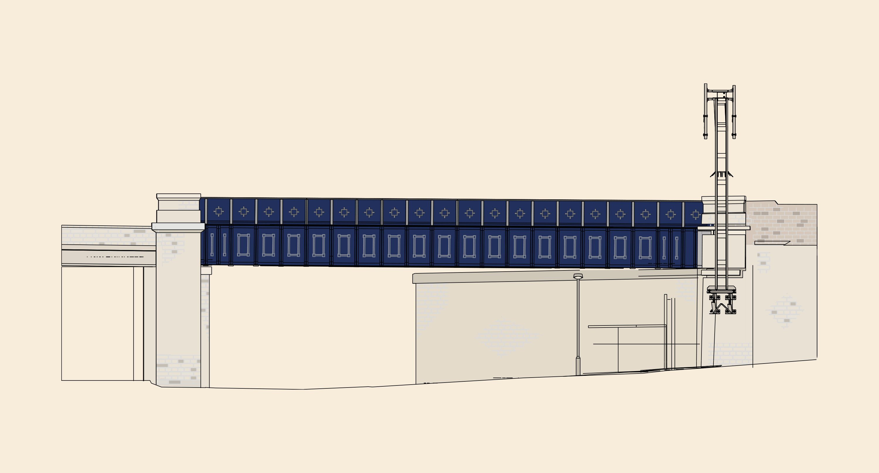
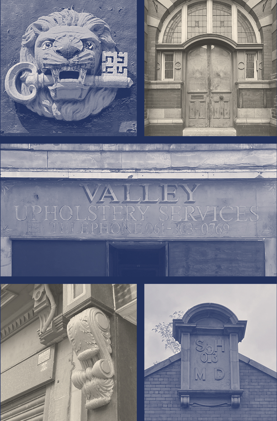
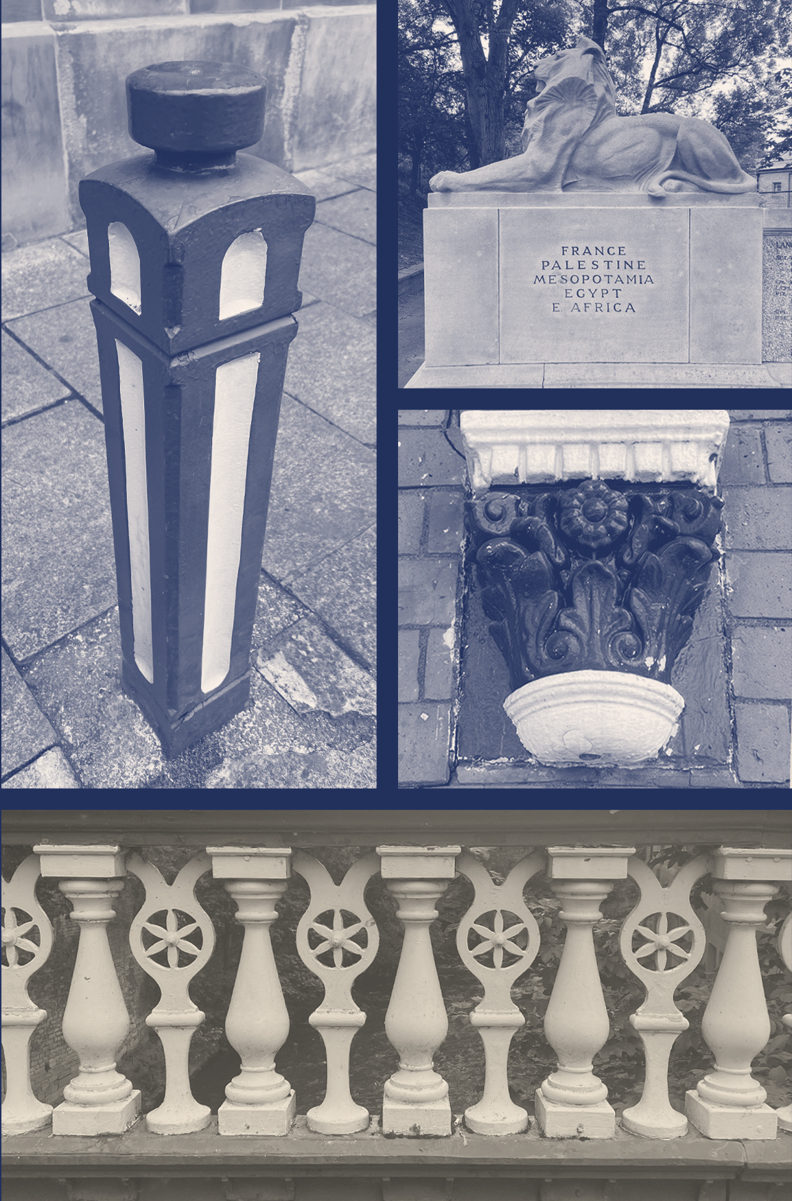
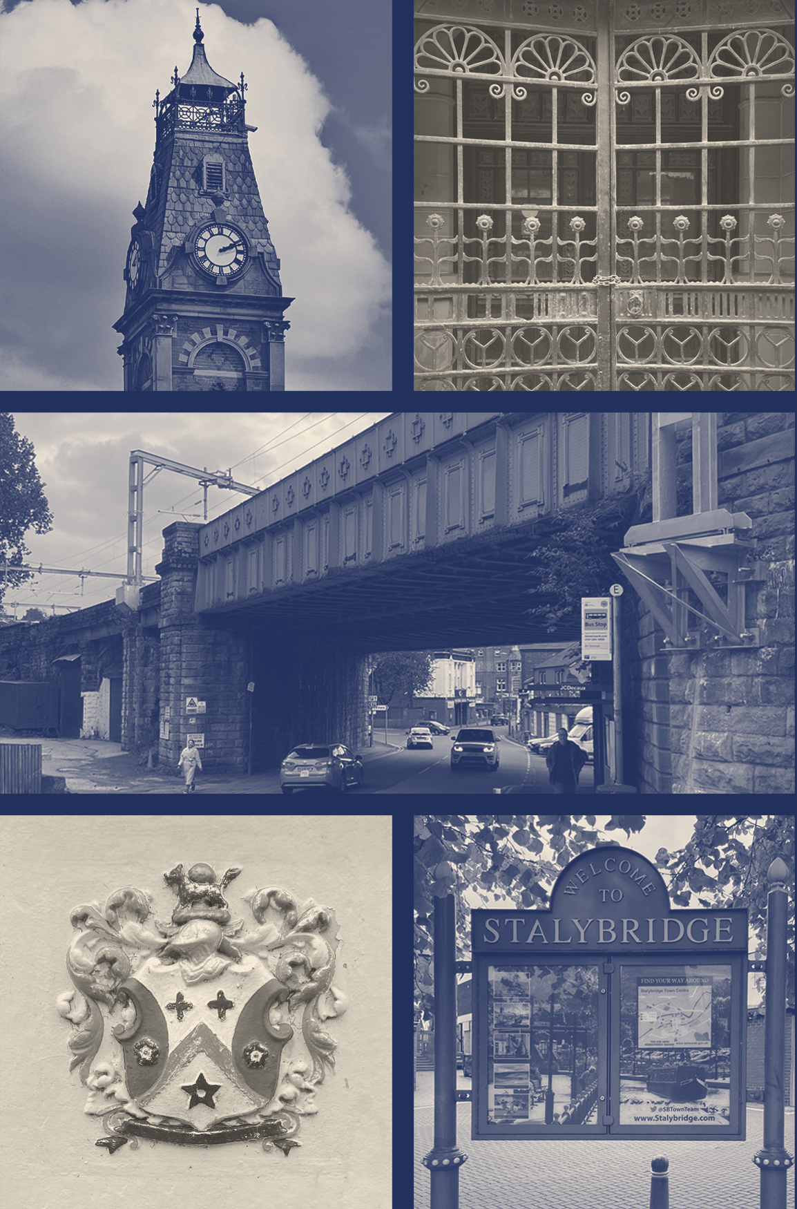
For Stalybridge, environmental branding is the rusticated masonry of the railway bridge, it is the crosses and wreaths of the town coat of arms, it is iconic details of the cast iron bridge over the River Tame and the traditional hand-painted shop frontages. These idiosyncrasies are repeated across the town, combining to create a sense of place that is meaningful and unique.


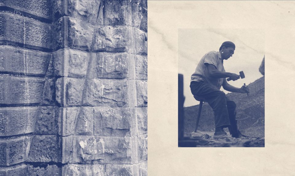
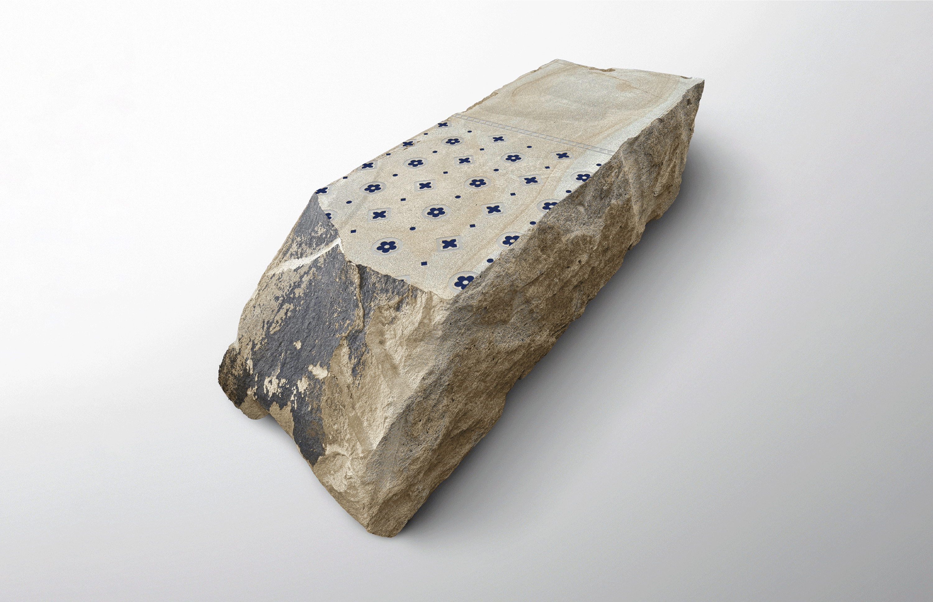
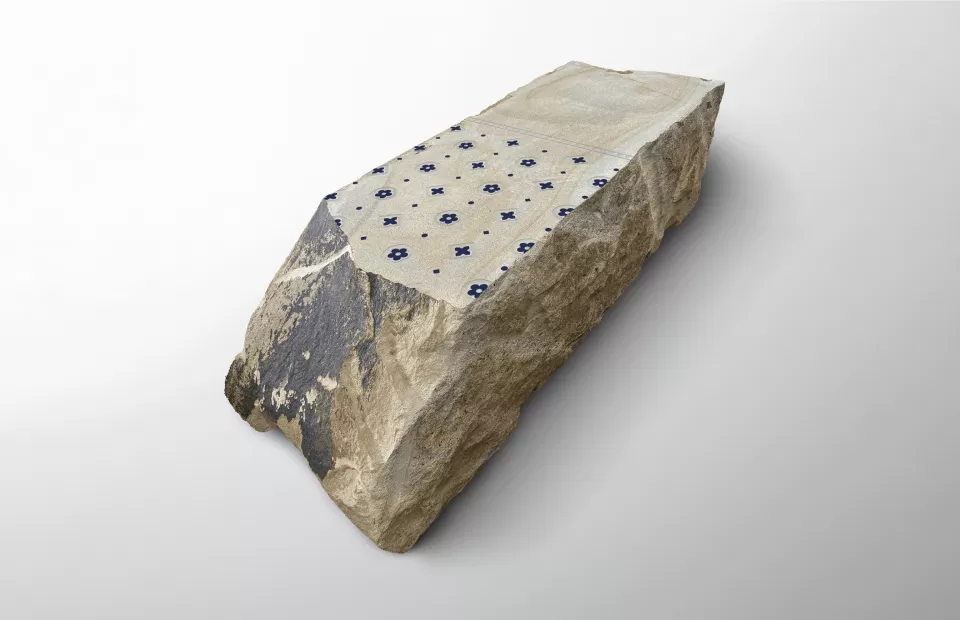
A Visual Signature of Stalybridge: Rustication Masonry
‘Rustication’ is a form of decorative masonry used to give blocks of stone a course, patterned surface. The technique is a common architectural feature of the sandstone buildings and structures located throughout Stalybridge and forms a distinctive part of the town’s aesthetic.
By avoiding the ubiquitous minimal aesthetic of contemporary architecture and planning styles we work to identify and specify materials relevant to a town or cities history or culture. Our research helps to form the foundation of a wider design code for new area regeneration, one that is considered, appropriate and relevant.
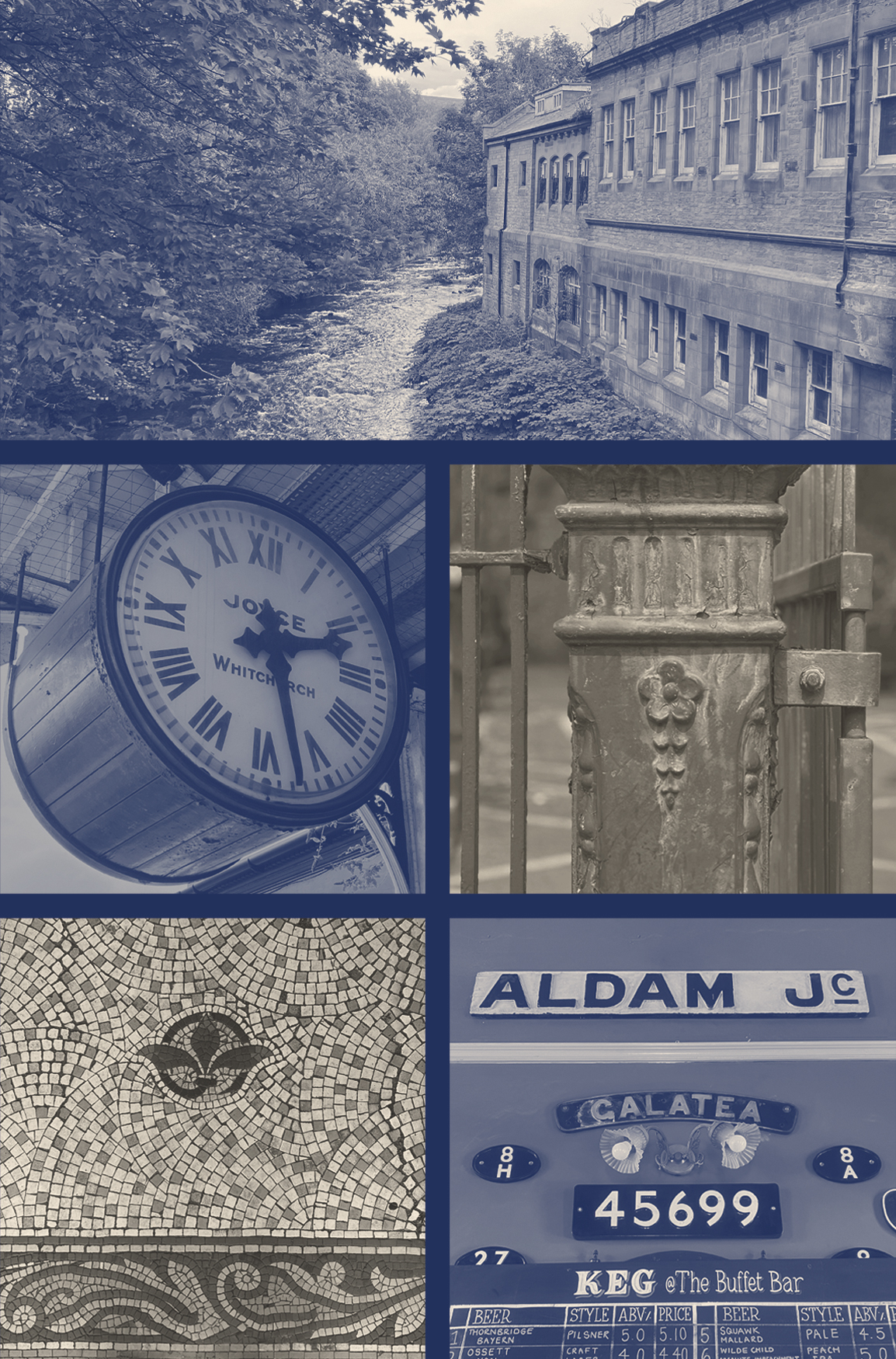
Preserving Visual History and Culture
During our site visits to Stalybridge we were able to identify a number of distinctive visual signatures unique to the town. These included materials, colour and iconography sourced from a cross-section of architectural features, the town's coat of arms, shop frontages and listed buildings.
A toolkit of our findings is then edited and drawn by us and provided to landscape architects to create a powerful new design code that can span shared surface paving design, bespoke street furniture and allow for a consistent approach to the use of colour.
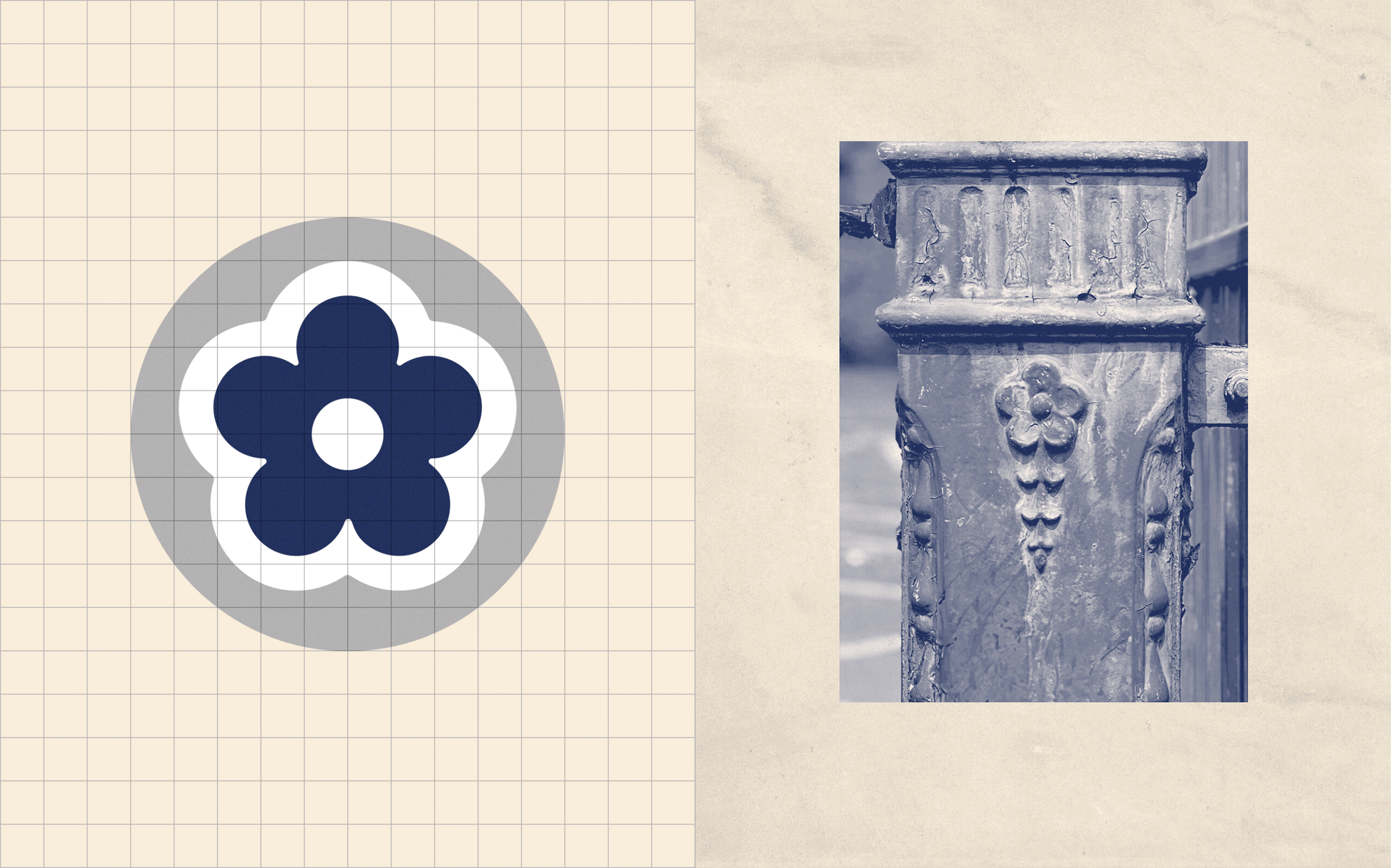
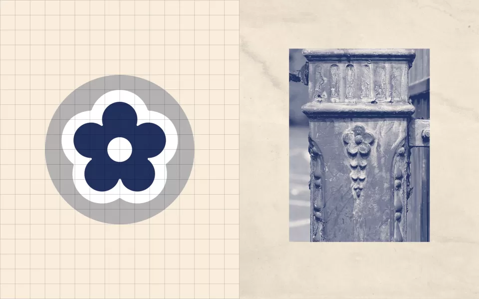
We have collaborated with Hardscape, industry leaders in supplying hard landscaping materials within the public realm. The Stalybridge clock tower has a steeply pitched fish-scale slate roof with ventilation apertures and ornate cast-iron crowning railings. After identifying this visually striking architectural feature, we developed a unique paving pattern.
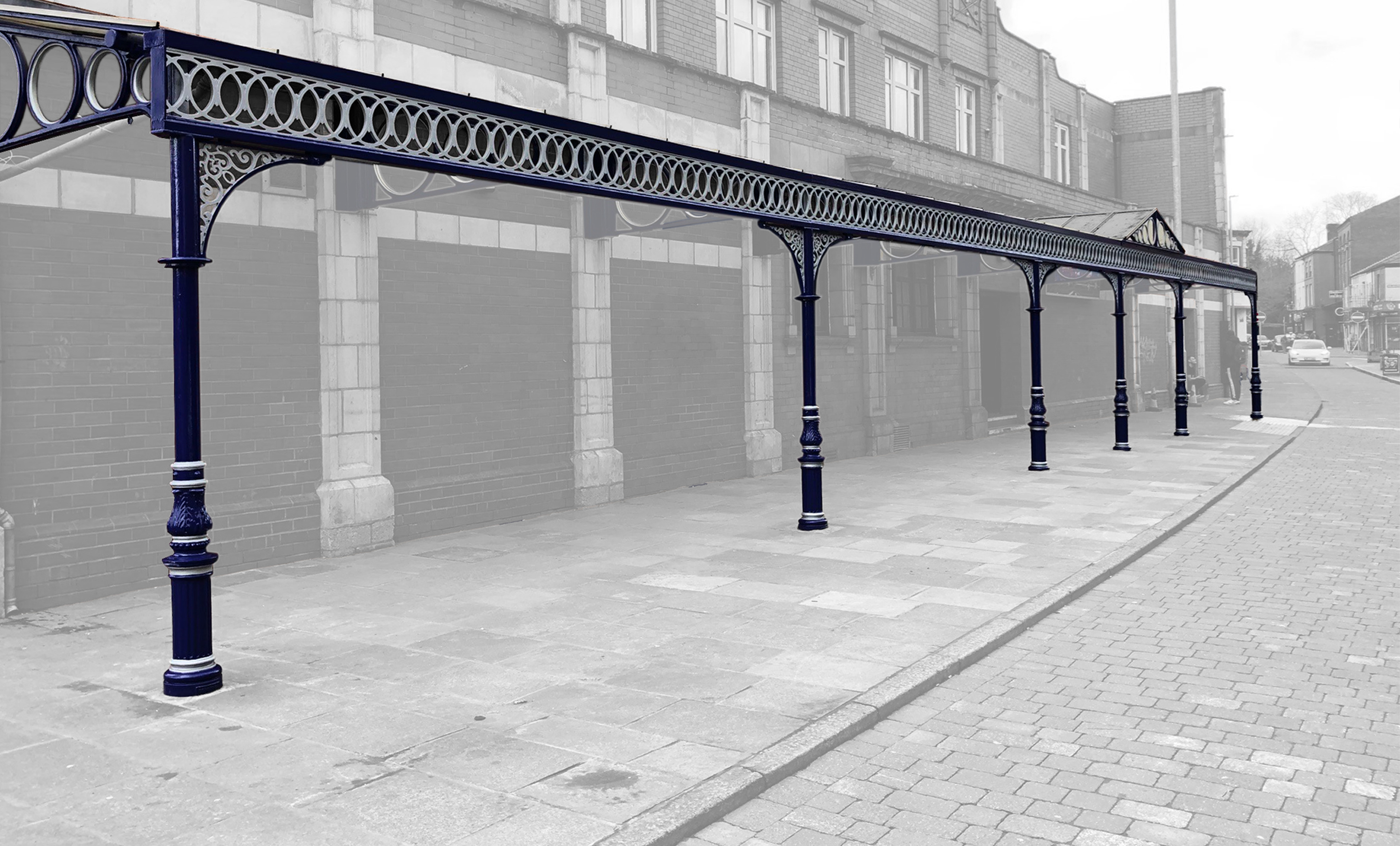
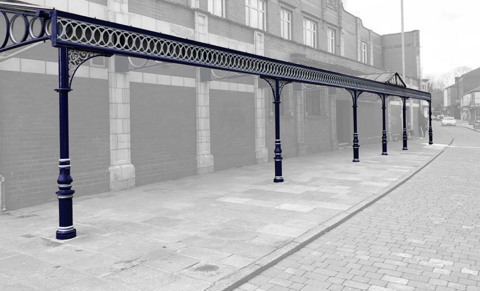
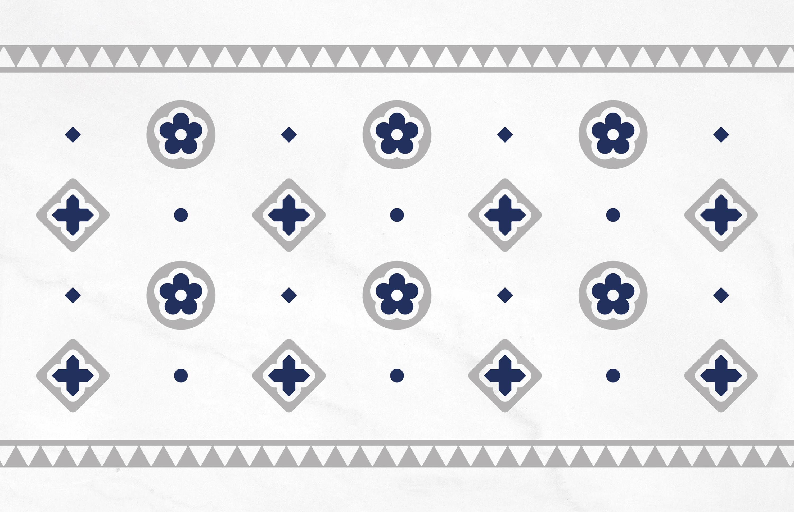
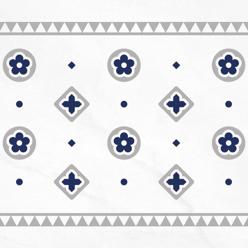
From our research and on-site photography in Stalybridge we identified a loose recurring blue and white colour scheme in use throughout the town.
Present on both public and private buildings as well as infrastructure, the existing scheme lacked consistency and showed age with varying shades of colour in different states of condition and distress. Rather than start again, we decided to define the colour scheme to a RAL Night Blue paired with a RAL Light Grey Pearl.
The latter silver metallic faired much better outdoors lending a more premium edge over it’s white counterpart. This scheme was consequently adopted over railway bridges, vintage cast iron awnings and street furniture.